Monday, 9 May 2016

Applied Animation: Final DVD cover design


The final design on normal paper


The final design on textured paper

There has been slight changes on the design since the last post: the description is added and the position of words are moved around a bit. I am very happy with the final DVD cover and we made two version of it just in case they have different outcome on printing. I think this is a cover that could tell the story just by its appearance and the light colour could also give a bit of a taste to the audience that our animation would be about watercolour and in a soft-style. I like the font as well which compliment the pencil line in the animation and make the whole project very cohesive. What's more, having some colour shown in the thumbnails could draw audiences' attention also let them to feel the world before watching. I think this exercise enables me to consider about packaging a product in every different way, think about how to stand out from other DVD on the shelf thus promoting our work. It could be said that we it is missing some colour and might look plain from a distance, we want to show the contrast between the pencil drawings and the watercolour inside so it would be more a surprise to the audience instead.

Sunday, 8 May 2016

Applied Animation: Evaluation

Differ from all the previous modules, Applied animation is time is to produce a documentary. I like watching documentary especially those about animation but never pay close attention on the animated part and could be purely informative for example showing a chart or line graph. Oscar, me and Lauren formed the group OWL and decided to base our documentary title on family. In order to embrace the animation with the topic, the content has to be something abstract and might be difficult to mediate, we start finding interesting white lies that parent told their children and aiming for a relaxing, funny and lighthearted documentary.


In order to learn more about the true experience, I set up some questionnaires and ask if my mother who is a teacher in kindergarten, could help me asking the children and parents about their real experince on white lies. Through the process, I noticed how hard it is to make a professional and polite questionnaire with appropriate amount of questions and information. It is more difficult than I thought and so it took quite a long time to finalise. It seems like I was the only one is the group who want the documentary to bring out some kind of educational message as the animation might lack of dimension but the rest of the group claimed that they just want to make an visually interesting animation and I really did not see the point pushing my thought towards them. Although none of the result from my questionnaires is used, it helped set up the final questions and topics we want for the animation and Lauren has collected the majority of reference from her family since they live quite close and she goes home very often. I could not help much in script writing because it will be best to have some proper English in the animation in order to raise resonances from the local audience so I only help with generating ideas.


We all want the animation to be soft and full of creativity so as to reflect the imaginations of the children therefore it is designed to be watercolour based with pencil outline on textured paper. I love using watercolour so it is very enjoyable during the experiment and I have learnt a lot of new ways of painting watercolour throughout the process for instance wet to wet and dripping water on top, that allows different effects and outcome that is suitable for this animation. At the time we had the interim critique, storyboard, character designs, colour texts and some line tests were done which make us pretty ahead within the rest of the class. However after that, we all have been focusing on responsive because the deadlines are approaching which made us all incredibly stressed out and busy. We did not follow the timetable for a couple of weeks and we started picking up Applied soon we hand-in deadlines for other subjects. I understand that as a successful animator, we will be constantly have multiple jobs or tasks at the same time and prioring a project is simply not allow therefore it is important to have a schedule for multiple projects that I could refer to everyday and this will be essential for next year undoubtedly.


During the production, me and Lauren were assigned to finish most of the animation and Oscar was also drawing some but mostly take part in editing in post production. It has been a while since the last paper animation and therefore I was very excited about it and wanted to proof how much I have improved since first year. However I found the timing very confusing because they want 24 frames per seconds by doubling 12 frames at the same time, for the transition part such as line forming, we are using 18 frames per seconds. In order to reduce confusion during production, I made a table listing all the frames and timing of each scene which is exceptionally helpful in organising work. Other difficulties I encountered is that the punch holes on the animation paper are in different positions. This was a huge disasters that the frames might displace when scanning and cause a lot more trouble. Despite of the greater time consumption,  there were really nothing I could do to fix but drawing a frame on every frame and crop around the frame later in Photoshop. I think in the next time, it will be a good idea to check the punch holes and everything than starting straight away as less mistakes would be made and improve the efficiency of work.


During the post production, Oscar wants to do the whole editing by himself even when me and Lauren ask if there is anything we could help and this make me feel so bad because I am not being very productive thus I want more contribute more. Therefore I take part in making the watercolour background, the stencil for the ident and the DVD cover. I have learnt about through this module especially working with others as a group. Nearly everyday we chat about the progress and plan online and use google drive to share materials, this is vital that we can all access the work we did which enable better quality of teamwork and communication. I become more confident in speaking out own idea and taking order as well. On the other hand, I may not be very good at claiming job actively and pretty passive during post production which needs to be improved. Also I want to improve my English level in order to help with the voice recording, script or any other writing even so that I could engage more into the project. Overall, I am very satisfied with the quality of work and the teamwork that we had. It has been a great experience in this year which we have a lot of opportunities to work with others but I still miss personal project at some point.

Saturday, 7 May 2016

Applied Animation: Final Outcome

Final Animation is DONE!


The final animation is done!and all of us are so proud of the result. What have been added to the animation is the school ident at the front, the OWL ident, the title, sound effect and credit at the end. I feel like I have done so less during the project, just a few watercolours background, animation and some ident and when I ask Oscar if I could help, he said me and Lauren have done a lot before and just leave everything for him to do. I do hope I could do more but I do not want to be too harsh but I do feel guilty that I could have done more. Anyway, the animation has improved so much since the sound effects are added on, it is amazing how sound does enhance the animation in a good way and it is as vital as the animation itself. I really like the style and that is just like how we planned at first and the aesthetic did not evolve during the production which enables a nice consistency through out the whole project. The colour is engaging with the pencil drawing since they both have a natural and crafty look thus the final watercolour looks so much better than the testing animation which I am so proud of. We all agree that the animation is completely done and everything is on track and fulfill our expectation! If I have to really picky, I would say the animation might lack of some dimension and pretty flat through out, might be it would be a good idea to make a video reference which might give us a better understanding of how objects should be positioned. What's more, the style of drawing could be more unified by studying each other's style and do some exercises on producing similar aesthetic. However I am still extremely pleased with the final outcome and hope the OWL group could form again in the future with improved skills and teamwork!

Applied Animation: DVD Cover design

A very sudden message from Emma on Friday afternoon
''Hi guys! I have some info about submissions for Applied on Monday. 
As a group you need to design a DVD cover and write a synopsis/ blurb on the back of that case. You will have to submit your disk in a DVD case with its cover. Although you've designed it as a group you will have to have your own individual copy of this case don't worry about the DVD screener mentioned in the submission info, Mike said we haven't been taught how to do it so we can't submit it''

To be frank I have not recently checked the e-studio and actually a bit shock that we have to actually have to have a DVD cover instead of the small CD case that we could find at the library in school. Therefore nearly all of us were rather nervous about this that we have to get a DVD cover within three days from nowhere. Luckily on Saturday Oscar said he found a DVD case from charity shop some we are using that instead! SAFE!

I want to make the cover since I feel like I have done so little. First I look for the actual DVD cover size and transfer the template into Photoshop.

I have learnt how to make the boarder from last responsive brief where I entered the penguin's book cover design, simply drag the ruler on the canvas and measure carefully for the size. 

Here are some designs of the case:

I applied a light watercolour at the back so that it would not look too plain just with the pencil title. Also Oscar wants to have thumbnails of the animation at the back of the cover therefore I try putting 3 to 6 thumbnails. Personally I think 6 thumbnails are too many and they will appear too tiny but Oscar like having 6 and I really do not mind. What's more, I also downloaded the same font he used for the credit in order to make everything consistent and representable.

I think there should be something more than just a title... a bit plain

Cover design with 3 thumbnails lined vertically and children's illustration at the front 

Cover design with 3 thumbnails lined randomly and without light watercolour painting


Cover design with 6 thumbnails and flipped the watercolour background

Final Designs

We want to have this design for our final DVD cover design because it looks the best out of the other designs. It has the texturised paper at the back together with the light watercolour painting. I also add the U rating symbol onto the cover to make it look more cool! Oscar and Lauren both concur on the design and I am waiting for Oscar to do the description since I am not confident enough for the writing bit.


Also he suggested that we should have two version of the cover without the texturised paper because the texture may not come out very nicely when printed so I take away the watercolour paper texture for safe.

Applied Animation: Ident Done!

So we started the ident drawing and we all have three frames to fill in. By looking at Lauren's, hers are amazing and packed with patterns which I would also like to try! So I draw one with a lot of eyes with the original stencil. Nothing meaningful in particular but trying to use patterns only. I also use a bit of shading to make the owl have more dimension.


Second, I think i might transform it into a different character and might be interesting to hide some of its features so I gave the owl a spy look with big coat and hat. The result is nice and I like how it looks so different from the stencil with more lively characteristics now.


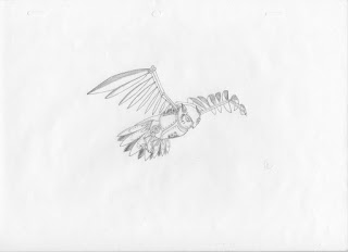
The last one, I always want to try drawing machines and so the owl becomes a machine bird. Drawing machine is so difficult, it is not only about the look but how it function as well. It has to be logically or otherwise it will not be convincing. The wings are the hardest part of the drawing because I could not imagine the mechanic of the wings, like what part could make the wings move. Eventually I created some random gears and 'steampunk' looking stuffs onto the bird and I am pretty sure it would not function in real life. Anyway it looks alright and drawing machine will be the next thing I want to master.


The final ident looks amazing when all the drawings are come together! I like the pencil texture and the natural flying motion. I hope we could make something like this again in the future and I could also studying other's style and find inspirations from their work.


Applied Animation: Editing and ident for OWL!

This is the animation with the watercolour put in! Thanks Oscar who make this looks cool and professional and I am glad that the colour appear super nice and compliment with the pencil drawing and the watercolour paper texture at the background. The splash looks very natural and I especially love the mailbox. It only left with the title and the ident then we are entirely finish the whole project on time!


And this is the more finished one with the title and the credit done!


For the ident, we decide to have moving owl that constantly changes in style and aesthetic like the one shown by oscar. I think this is an amazing idea that could make the animation look so professional as if it is produced by a animation company in the industry. The way of mixing different styles could also represent our flexibility in  changing different aesthetic according to the taste of the clients.It also accomplished with the similar pencil drawing like the style we have in the animation which make the whole thing more consistent and unified.


I made the stencil for rest of the group to draw on, at first I was not sure how much details I should put into the stencil and made it too complicated and contain a lot of details.

But soon Oscar advises that it's better just have the outline so we could fill in what ever we want and therefore here is the final OWL stencil!

I also produce a flying cycle by studying the references online. I noticed that even birds changes height constantly even when flying, when they swipe their wings downwards that when they soar. In order to make it logically, I change the wings, the height and the body slight in every frame so as to have a smooth flying cycle. They like the design and we are starting to fill in the stencils with our creativities!


Friday, 6 May 2016

Applied Animation:Time management and further editing

We are at the stage just right on the final crit week and we have about finished the animation, just need final editing and finalising and we are on schedule!

About organising work, we have been using google drive for exchanging and share work we have done. It is so useful and handy when referring to work or just to keep update to other's work. Every file is clearly named and sorted to make sharing more efficient and reduce confusion on frames and scenes. 


We also always chat on facebook and share anything we have done.


I am in charge for the water colour backgrounds for the 'creativities' part of the children's imaginations. And I was advised by Oscar that I better fill the whole paper so that he could animate the colour more easily and so I did! it is actually easier to fill the whole paper than compact all the colours in a small corner. I use mult-colours even though is it just for one colour, like use different kinds of red and orange, a mixture of reddish colour for a post box; for the teddy as well. I like the gradient watercolour shows on paper and it is very soft and provide a lot of textures. The splashing water scene is the one I enjoy making the most. It's because I actually did splash the watercolours on to the paper in order to make the natural splashing effect which cannot be done by painting carefully and in detail. I love the final look and the mixture of blue gives a lot of definition and layers and I cannot wait to see it applied on the animation. The colour colours are for the kid's thought and the easter egg. Base on the first test on colour, I allow more colours to flow and interact with each other instead, enabling more natural mixture of colours and it is less artificial. I use a lot of bold colours like red, yellow and blue to make the colours pop from the dull background and line work which they will make contrast to and stands out.


Applied Animation:Final Crit

During the final crit, Oscar had put all the frames me and Lauren have done into the animatic to show to the rest of the class for useful feedback, there wasn't much constructive feedback from the class but Sara said the stamp and the postbox scene needs to be improved with giving more facial expressions to the baby, make it more cartoon like so that the posting scene would not seems too cruel and harsh to the baby. Since we all followed the original animatic and I did not really see the point of changing the scene dramatically and we all decided to give it small changes on the baby's facial expression after the crit. The animatic did not show all of our work, some are left out and maybe still editing but the class got a good knowledge of the stage we were at and I think we were pretty ahead of everything.


At that point, I did not think I have anything more to do instead of helping out with different things. I was not able to do the voice recording as we all want some  voices without a foreign accent so I have been doing Cop for a while. During the Crit they also suggested that the rip off the roof scene, the interior needs to be shown more clearly with some furnitures in order to indicate where it is and so I will be doing that. We are so organised and everything is on schedule and very on track. I hope I could have given more job since there is a feeling that not much work has done by me...feeling a sense of guilt therefore have been constantly asking Oscar if he needs help.

Applied Animation: Production!

I have my frames list sorted out before starting the production, which has the numbered scenes, frame numbers and timing also marked whether it needs to be doubled frames or not. This is very useful as a check list  and could refer back while getting lost during the production. I would love to have another check list done for any other project in the future because it is so useful and organise my whole production time.


I did not record anything during the production since I was so focusing. This is the only picture I have from my boyfriend's phone and this is the Lightbox we made last year and basically I did most of the frames at home where I could be really messy and have more space.


And these are the finished frames!
Through out the whole work, I absolutely love this teddy bear turning scene because I could show my animating technique and it is very challenging to animate thus it links perfectly with Oscar's scene which I am very proud and satisfied with.

Test frame

Final scene

I think i like the test frames more maybe due to the sketchiness and the not perfectly finalised line drawing but the clean version is very professional looking and the angles are nicely considered. I hope I could get more challenging frames like this and surprisingly this scene does not take too much time to do so I was very pleased with everything. 

The other scene I enjoy is the bunny growing scene which I first produce the keyframe tests in photoshop to make sure it is a smooth transition and then transfer it onto paper. Although it is not really noticeable about the easing but I did give more frames at the beginning and at the end which make the animation looks more natural and visually interesting.


test keyframes

I am happy with this. I think it could be improved by giving it different facial expressions while growing or different poses. It looks a bit plain and there should be more reaction to a bunny when it is magnified. During the preparation, I did not think about the presentation of the character thoroughly so end up having plain characters in the animation. I should have take more time, preparing and sculpting the character instead of focusing entirely on the drawing technique (actually I should focus entirely on both) and this reflect in the animation directly which I wish I could improve this next time.

final growing test

Testing scenes

These scenes are not in the correct timing but they are put together to see how the frames flow. Overall I am happy with most of them but there are a few scene that I did not good at expressing for example the buying teddy scene. I feel like there should be more happening...maybe less is more? The scenes are shown to other members of the group, they like it especially the teddy changing angle scene. I hope we could have more time improving the content but at this stage I am pleased with what I have got.

Applied Animation: Animatic


I found it really hard to start the animation from plain. Especially for the timing. I was lost about the frame number and other stuffs since Oscar suggests that we are doubling the frame of 12 to make it 24 frames per second but we are using 18 frames per second for the transition part, for instance the line forming and the bunny turning bigger scene, the scenes that need to be super smooth. And these framing problem makes me so confused so I have the animatic re-export again with the timing shown on the bottom that I could refer to the timing while counting the frames that I need to do. This has helped and make the production so much easier.

I also started with all the key frames and marked the frame number in order to make it easier to fill in the frames in the middle. The animatic isn't showing what the characters are doing exactly so I have to use some imagination to complete the scene which is so exciting and worrying at the same time because I don't know if they would agree on the actions or not, so I keep close contact with OWL group and exchanging information through out the progress.


Applied Animation:MORE Look test

After the interim Crit, we were advised to make some look tests before starting the production. I think having a look test could enable us to set a firm aim on the style we want and make sure all of us in OWL could contribute to unified aesthetic of the animation. Most of the people said that they like our watercolour test in the crit and the transition of the line which we have tried to combine both by scanning the watercolour painting in and use after effect to edit the transition. 

Mailbox colouring

I think the transition is a bit too fast and need easing. We could use use another brush instead of a round brush in Aftereffect to make the transition more 'water-spreading' looking. But this is the effect we want and it looks really natural and creative. While Oscar and Lauren were working on the mailbox transition, I start testing whether we want thick pencil line or not for the overall animation.

I use photoshop the use multiple effect on the line drawing, place it on the watercolour drawing and have the following results.

Thin line


Thick line

We are agree on the thin line drawing because it is soft and let the watercolour shines more. Through the process, I realise how much I like watercolour! I find it really satisfying and intriguing and so I hope I could in charge of the watercolour painting for the 'creativities'. What's more, I will use a lot of bold and colourful paint for the backgrounds and 'creativities' object in order to make contrast with the plain pencil line. We should really start the animation!