Saturday 13 February 2016

Responsive: Do it Ten

The theme of Do it ten animation competition in February is Dark. I want to enter this just as too keep myself busy animating and also practice traditional animating skills. I was not planning to make a brilliant international standard animation but more enjoying the process of animation.

I do not want to make the animation too depressing or scary therefore I go for the ideas of animals that are active at night.

 Before the final decision, I drew a lot of short story related to Dark. For example a Monsters. Inc inspired story; Play around with ripples of sound in a dark background; scary haunted story.


Eventually I come up with a story that can play with camera angle and more practical in terms of drawing skills and at preproduction stage.


As the animation needs to be in exact 10 seconds, the timing has to be precise and clear at the same time. I was not sure how to end the story since it is lack of content and storyline, it gives me a feeling of a dream or an imagined place, maybe it is best to make the cat disappear from the screen?

I did not understand the walk cycle of a cat and i did not have any reference when drawing the first experiment. It does not look like a cat at all because of those fat legs and unnatural looking walk. 


Therefore I need to practice the body and the walk!

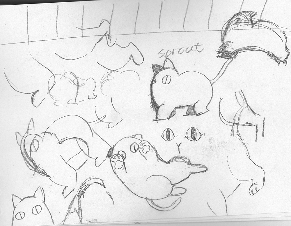
Cat has an unique pattern of walking. The legs move in different time instead of two legs move at same time. I studied the walk from youtube where someone put a slow-motion video of a cat walk.

I love to design a round body to the cat, make it cute!


Wednesday 10 February 2016

Applied Animation: Research : Artist Yawen Zheng

YAWEN ZHENG - ANIMATION REEL from Yawen Zheng on Vimeo.
I like this Artist a lot! Her unique style is very beautiful and fairy tales like. I especially love the texture at the background which looks like a lot of vibrant acrylic colour and characters come to live on canvas fabric. I wonder how she introduce this aesthetic digitally and maintain the traditional features of the moving image that inspire me to try out her distinct style and practice more on the motion and movement of character. After I watched her showreel, I noticed how 'standard' my animation is and make me want to practice the 12 principles of animation again.

Applied Animation: Research: A New Hue


A New Hue from George Rigby on Vimeo.

I found this amazing animation on Vimeo which is similar to what we are aiming for in terms of style and concept despite in the use of 3D. The character design is very simple and cleverly build up by paper, acting on the stage of paper also, successfully draw attention along with the watercolour. Ridby edit the animation in maya and introduce watercolour texture using aftereffect. Watercolour is very hard to show in animation. t is very difficult to show the spread of colour digitally which has a distinguishable difference with the real watercolour. Although you will notice the digital colours in Ridby animation, he manages to make them look natural and spread beautifully across the stage, making an memorable and beautiful scene. One thing I like about watercolour is the spread of watercolour on the texturised paper so if I were making this animation, I would include texture of watercolour paper as well. In our applied project, we are introducing parchment paper texture at the background with traditional drawing on top which is going to show the natural-goodness of animation. I would like to find out the best way to animate the spread of paint in aftereffect like Ridby's animation, by experimenting both traditionally and digitally.

Applied Animation:Interim Crit

I did not contribute much on this powerpoint which mainly done by Lauren and Oscar, I feel a bit bad about it therefore I try to speak more during the presentation. We saw a lot of interesting ideas from the rest of the class which are very inspiring and creative.For instance the interpretation of research of Ollie and Greta's group, they extract the essences of the interviews and merge with different characters and situation, forming an exciting composition of information. Other groups have very unique style and approaches toward their animation as well which are creative.


After presented our ideas, the class like our style and approaches towards our animation. They like the watercolour lines and pencil work. We are suggested to work on look tests and more experiment on the watercolours. The next step we need to do are look tests and voice recording. We struggle to find suitable people with subtle voice who can say the script naturally for us. Although Sara thinks we can find students from a drama course from other school, Oscar did not think it would be efficient to cooperate with student outside school because it might take too much time to communicate and referring. I think it might be best to find family and friend to do the voice instead which might be more easy for us to explain the content as well. OWL group also has decided on our new schedule and aim!

Applied Animation: Storyboard and Animatic

Here are the refined storyboard done in Photoshop by me and Lauren. I want to follow Lauren's style to draw in fine lines so I tried. Oscar is making an animatics out of these without voice recording test I order to get a brief understanding on the timing.


I think the storyboard is nicely done and we have excellent communication through Facebook and goolge drive while we are at home. The work are shared immediately so that group mate can access and make changes which is very efficient and effective. The timing of the animatics might need to change a bit in order to match the final voice, we still need to decide on the look and style of the animation also how could we fuse in watercolor with line drawings. We have timetabled ourselves with a lot of tests and experiment and discuss which one we like eventually would be our finally style.


Applied Animation:Transition test

I have done a few transition tests using watercolor and edit in aftereffect. It has been a long time since the last watercolor drawing, it feels great picking up a brush and actually do some real painting. The control of paint and color is difficult but you will get excellent effect even when strewed up:) I was not planning to get that much wash back in the first painting, I had used too much water on both the brushes and the paper. The wet to wet method is not the one to show vibrant color but beautifully spread of paint. The color is diluted and too soft which is not I want.


The second test is a lot better and closer to what I want. I did not wet the paper but mixing wet paints together. The colors are a lot stronger and have better control when mixing. I also use contrast colors to make it more visually interesting. I will use this method when producing the final watercolor painting but work a lot quicker in order to let the paint flows better and avoid edges.


These are the tests done by Oscar and Lauren at the beginning of the project. The default brushes In photoshop are not the best tools and look nothing like a watercolor brush. We thought it would be better to use real watercolor and scan it in to get the texture and asethic.


The method Oscar use in aftereffect is called stroke where you can make the colors or picture show like recording the strokes. We all think this method will be very useful in later on the project and very doable.

This is a the test I did using the scanned in watercolor painting in aftereffect, masking the area I want in black, multiply the layer. I like the watercolor bush I made in Photoshop which is very realistic and the strength of the stroke is controlled by the pressure you put on to the tablet. The color stands out from the white background and everything is so dreamy and visually stunning.


Also a quick paint of the post box which is one of the object has color. 


This is a transition test done by Lauren using traditional method to animate the first part of the animation. I think drawing on paper is our final decision because we want the texture and the craftliness inside the story. We want it to be less machinery and lighthearted which the texture show able to present most of that. What we also want to do is to introduce some texture to the paper as well, like parchment paper. It might be a good idea to scan I some real paper and extract the texture through photoshop and layer it behind the traditional drawing.


Tuesday 2 February 2016

Applied Animation: Thumbnails and storyboarding

Owl group had another meeting during the holiday, hoping to get the basic storyboard done before the interim crit. Everything is in schedule and very organized. As mentioned before, we want the story to show big contrast between the imagination of the kid and the reality that their parents are hiding by using watercolor to represent the creativity. 

Along with the script, we have calculated the timing briefly and the events we want when drawing out the storyboard. It is very difficult to be simplistic but informative. Also Sara told us not to include too much unnecessaries since the script has already given out quite a lot of the situation. For instance we were decided to make the mum walk into the house when the scrip describe the new born arrives, Sara suggests that the door would not be needed if there is description at the background, audience would know the situation. In fact, Tina lot of film, cuts of the camera angles also work the same. In spite of following the actors in action, a quick cut into the result is more fun to watch.


Anyway, we manged to keep the content quite simple and clear with a lot of fading transition to show the change in environment rather than sudden cut. The transitions are mostly going to be deformation of lines, reforming another character of scene for the next shoot which would be the best method to maintain a consistent style and a cohesive story.


I like the Easter bunny story the most because I think it has the most interesting build up of environment where we want the walls of the house gradually formed while the rabbit grows bigger. The camera angle is very dramatic just like how a child would imagine a huge Easter bunny. I think we have  include all the details and the most important information in the storyboard. We are improving it by drawing a better version with good quality of lines and some colors at the end of this week.


Also a quick update of the new Easter bunny character design.sara thinksi can push the shapes a lot further so I make the bunny in trangular and thicken the fingers and body. I think it looks a lot more unique and playful than the previous design. The one I did before is a cliche of Easter bunny which is really boring compare to the new design. This is unlike my normal style so it is a new attempt to me.