Tuesday 30 December 2014

Magic Lantern

Magic Lantern is a image projector that was believed to be created by Christian Huygens, Giovanni Fontana and Athanasius Kircher. It was one of the oldest devices that could show still and moving images in the past as entertainment and religious tool and the Magic Lantern was wide used in different classes which satisfied the obsession of new technology and supernatural and it is a huge industry at that time. 

The Magic Lantern only  consists of a few major parts: The body, light source, lantern slides, concave lens and the front lens. The body is there to hold all the parts together onto a projector and the size and shape vary when the amount of information increases.

It is believed to be a small Magic Lantern. It has a camera like body with one front lens.

A triple Magic Lantern that can project more images and effects at the same time

Oil Lamp and candle were the only light source during that time. They were extremely inefficient and reduced the quality of the images since the light was not strong enough to penetrate through the lens onto the wall in order to show a bright image. What is more, it could be dangerous to light up fire inside an apparatus.

The stained glass or the lantern slide is a thin drawn and coloured glass that is put between the light sources and the lens. Multiple lenses could work together so as to produce moving images and other illusions by switching the lenses consistently. Since the new technology had been introduced, people were managed to print photographic images onto glass which was the beginning of mass production of magic lantern.


Here is a video talking about the contribution and the operation of Magic Lantern. After watching, I am more enthusiastic and grateful about the ancient projector devices. Compare to the modern apparatus,  the magic lantern has an advantage of cooperating more closely between the operator and the audience. It takes a huge amount of time in preparing the glass images and the devices which receive more appreciation then the 'instant production' we have today.

Tuesday 9 December 2014

Bubble Bee by Walt Disney 1948 and A Baffling Balloon Behaviour

Bubble Bee by Walt Disney 1948


This Disney short cartoon gave me an idea how light weight object (in this case bubble gum) will act. The bubbles created by the gum is light and have similar properties as balloons. In the cartoon, the used the reflection of light and the wobble movement are important in creating the light weight and floaty-ness of the bubble. Also, the direction of the bubbles are mainly depended on the direction of wind and the surroundings. 

A Baffling Balloon Behavior - Smarter Every Day 113


I watched this on youtube to try to understand the science of helium but it is not clear for me. Apparently helium is lighter than oxygen so that it goes to the opposite direction of oxygen when accelerating. I am so confused and I wonder if this is essential for the animation. I might not animate this property of helium because I am not familiar with it therefore probably should focus on starting the animation for now. Might come back later for this thought.

The Classical Element Development: Character design and storyboard

Character design is the next development I did for my animation. The feedback I received from the previous crit encourages me to investigate various characteristics on the balloon to a certain extent. I tested out different style of eyes and face which provide more ideas instead of restricting myself from the initial concept art. 


I have chosen the balloon with eyes with the white part (If that make sense). I chose it because it is not a style I have tried before and the emotions of the character travel more directly to the audience due to the diverse use of those simple shapes and the eyebrows. However, the consistency of the drawings could not be easily maintained and therefore I need to draw slowly in order to make sure the shapes are similar. 


Character design of the kid. 

I have not decided on the gender yet but this character is probably a little boy who is not talkative. The odd hairstyle and 'mouth-less' state his introvert personality and he wants a good friend in his life just like any of us. In these drawings, he has eyes but not in the storyboard. The comments I got from the class is that they like he without the eyes,(It was just a mistake as I forgot how long his fringe is) and this mistake has confirmed the final look of the boy. I am happy with the result and hopefully the this dialogue-free character will not be too eye catching.


Storyboard. 


Compare with the previous storyboard, this is way shorter and simpler. There is more time to express less which could slowly build in the atmosphere. I did not like to rush the information therefore this is the ideal length of the animation. I have asked Matt and Max about what they feel about the story and they said the story is sweet and expressive. They like the characters and how I made the yellow balloon to stand out by only giving it eyes in the whole story. 

Anamatic


I feel like this is the right timing as each key moment will be shown in an appropriate time, allowing the audience to digest and interpret and hopefully this length of time allows effective story telling.

Monday 8 December 2014

The Classical Element Development

I have animated a 1 second clip using the chosen art style on photoshop.


After the experiment, I realised I sat the timing wrongly and did not get the result I expected. The one second animation contains too much information which the information within should definitely be reduced. If this speed is maintained, the animation might end up bombarding the audience with a messy content for 20 seconds, no time for digestion. Therefore I am redesigning a storyboard that has less information and mainly focus on the characters and the 12 principles. I major thing I need to focus on is the timing therefore more tests are needed. What is more, the drawing method I used in the experiment was not effective. I struggled to trace the previous drawing because I coloured he frame before moving on to the next frame. This disable me to get precise outline and the content between key frames and therefore it might be useful to sketch the basic outline before colouring. I hope this allows define outcome and maintain the accuracy.

After Effect Induction (2)

We have learnt a few more functions in After Effects and which were NOT BORING!


We had chance to play around with different material provided by Matt(?) and I made a bouncing sunflower.


I found it hard applying bouncing and stretching principle digitally. The image is so rigid and I am totally disguised. 


The rotation effect is difficult to get it right. Have to relocate the anchor point in order to let the balloon ship turns up side down 'logically'.


Easing in and out is probably the best effect it has which is extremely useful when making animation. The shapes move beautifully with the effects and we can change the speed by changing the speed graph. After all, after effect is an useful programme for me to edit videos but I do not think I will animate using it.


The Classical Elements: Development

After the group crit, I rearranged the colours of the balloons according to the feedbacks I received. The first bunch of balloon has a low saturation of colour but I am not fond of the tone which is dull and lifeless. The colour does not introduce a relax and happy atmosphere so I do not like it. The pastel colour at the end is the best colour out of these tests in my opinion. I have received some feedbacks from the class, most of them like the pastel balloons due to the dreamy and colourful properties that would not over-shone the yellow balloon.


As I was not sure about the style of work, I tried out various way to outline the balloon. The top left is my favourite because it is clean and simple whereas the others are not neat and I realised that black outline is horrible... 


Experiment 1:( please click the picture to look at the gifs )

This is my favourite outline and the product is clean and comfortable when watching. This would probably be my style eventually.

Experiment 2:

This wobbly outline is not bad but this could cause confusion when applying onto all balloons. Nevertheless, I like the sketchiness and simplicity.

Experiment 3:
OK, this is horrible. Never use bold black outline.

Saturday 29 November 2014

After effect induction

After effect is a program that can edit videos and to create moving images. I have experienced this program before when making the stop motion animation by following the online tutorial. I managed to edit the animation step by step but I am not familiar with it at all. This induction is very useful in teaching us about the basics and inform us what the program is capable with. I think it is very alike Premiere and I could not tell what is the difference between...They perform quite similarly therefore I picked up rather quickly during the lesson.

Notes

  • The panels can be resized and changed by selecting [window]->[workspace]
  • [Preference]->[Media & Disk Cache] Cache is the temporary file the computer creates itself in order to make things quicker if doing repetitive job
  • [Settings]->[PAL D1/DV Widescreen Square Pixel]
  • Layer properties is the small triangle pointing to the right
  • [Composition setting]->[resolution]->[full/half]
  • Key short cuts:P=position; A=anchor point; R=rotation; S=scale; T=opacity; N=end of the clip; B=beginning
  • Always play back using RAM review!!

Monday 24 November 2014

The classical element- Interim tutorial (group crit)

I have presented my ideas to my group and I received some unexpected responds and useful suggestions from them. The presentation went quite well and I was not too nervous which allows me to explain my ideas clearly to the group and this improvement encourages me to speak up. My group mates have a lot of good ideas and developments for their own projects and I am very impressed about the efforts and time they put in. Providing them comments and opinions enable an alternative way of reflection on my own project for instance what do I need to focus on and what am I missing.  

  • We have discussed about the content of the two storyboards. Most of them like the simplified storyboard (the second storyboard) better due to the rich in camera angles and the simplicity of it. Max said he found the unexpected plot in the first storyboard is quite interesting and maybe I could create another storyboard with a twist but simple simultaneously.
  • The second storyboard would be more appropriate to do in terms of the time management, the workload and the amount of information. 
  • Whether the balloon character should own a facial expression or not. I told the group I have watched The Red Balloon and the balloon does not have a face in the movie but it could still act and show its thought. Amy suggested that I should give my character a face because in the movie, the audience have time to discover the character. However, as we have a time limit, it should better be sharp and understandable which I think is the most useful comment of the day.
  • The style of work:

They like the sketchiness of these illustrations especially the style which the outline does not fit the drawing. 


They are not really fond of the white outline and they thought this art style is a bit commercial. Looks like a birthday card. However, they like the faces without the mouths better. I am thinking another way to combine both style together as I really like the art style on the last one.


They suggested that I could tone down the other colours in order to let the yellow to stand out from the crowd as It would be odd to see kids holding black balloon after all.

I feel much more confident about my work after the crit and I am going to take their opinions into account. The next things I need to do are:
  • To decide on the style of work
  • tone down the colour of the rest of the balloons
  • Sort out sound effects and background music
  • Primary research on the natural movement of balloons and observe.

The Classical Element: concept art

I really want to draw this animation in photoshop because I am not good at digital drawing therefore it is a good opportunity to challenge myself. Base on the media, I have drawn some fundamental concept art for my animation on photoshop. The quality of the drawings still need to be improve but the sketchy drawings give me rough ideas on the use of colours or styles on the characters.


I am trying to find an appropriate colour for the main character. I noticed that red could catch a lot of  attentions but it could be quite intimidating and it is an angry colour. The other colour that is still eye catching and happy is yellow and I am happy with me choice.


I do not like these concept art because the drawings are too sketchy and I wonder if they will look professional enough as a finish product. I tried different styles of art on the character for example with outline and in various shapes. I feel like they could be developed further more and base on these ideas, I move on to another style of art shown as below.


I am happy with this style of art better than the previous illustrations because I like the graphic design and the hand drawn visual effects. The facial features are simplified that the balloon now have no mouth as it could still express its feelings using only its eyebrows and eyes. Excluding the mouth makes my character unique and less Japanese anime looking which I have been avoiding all the time.
I doubt about the colours. Should yellow be the only bright colour within the balloons or not? I am hoping to gain some opinion from the interim crit.


The classical Element: Storyboards and Anamatics

The problems of the previous storyboard are:
  • too much information to show in 20 seconds;
  • too complicated
  • too much workload at this stage( I have not done primary research and refine a storyboard)

The anamatic suggests that there are too much information within the story which would be difficult for audience to understand straight away.

Therefore I designed another storyboard instead and this time it is shorter, sharper and easier to understand as a 20 seconds animation.


 (random cat sketches!please ignore!)


I think this story better than the previous one because:
  • it is shorter
  • clearer
  • appropriate workload
but would it be a bit random at the end?

Sunday 16 November 2014

The classic elements development

We are given a topic, the classic elements, to produce a self directed project. I could not decide on which elements to work with therefore I made a mind map at the beginning to help myself identifying the potential of the elements and possibly choose an appropriate element to work on. 


After a few brainstorm, I noticed that water as an element would be fun to develop so I started sketching ideas down. I drew fantasy creatures like mermaid and dragon and marine life like dolphins and fish. I like the idea of letting tropical fishes as the main characters the most because I like the way they swim and the habitat they live.


I picked up the project after a few days again and I had another new ideas which is to use both air and water to produce a touching story. First, I list some ideas on my notebook about the combination of those two elements and I came up with: flying fish; Swimming balloon; Swimming bird (penguin); and Ballon fish. Balloon fish gave me the biggest inspiration therefore I made a rough storyboard and tested out different possibility on creating a story about balloons and fishes. I want to do some research on the facial expression of an object.

This is the second attempt on the storyboard. I quite enjoy the story in terms of the characters and the camera angels but there are some frames I do not know how to present them for example It is difficult for me to draw a boy who gets a jump due to a shock.


I was recommend to watch 'The Red Balloon' which is a film about a balloon that has a character. I found it extremely useful as my idea is similar to the film so there are some good reference and problem solving techniques I could learn from the film.

Friday 14 November 2014

Le Ballon Rouge (The Red Balloon) by Albert Lamorisse


The Red Balloon is a short movie about a little find a red ballon on the way he goes to school and find out that it has its own will and mind which can communicate to the boy by floating up and down and other actions. The director had geniously given the red balloon a character and own thought by only using it actions and movements which blend in so well with this no-dialogue movie. Also, the vividity of the balloon brights up the boy and his surroundings which differ him from the dull town and the audience can feel the joy and magical atmosphere even more.


I think it is appropriate to not give the ballon a facial expression. It is because the director can show more skilful techniques in order to impress the audience. Additionally, it allows more spaces for audience to project their feelings onto the balloon and encourage diverse emotional responds to the story.


This is my favourite part of the film where the little boy asks for shelters for the red balloon from the people who have an umbrella on the street on a rainy day. This action shows the innocently mind of children and how human can generate relationship with objects by giving them minds and wills like human. 


The Blue Umbrella


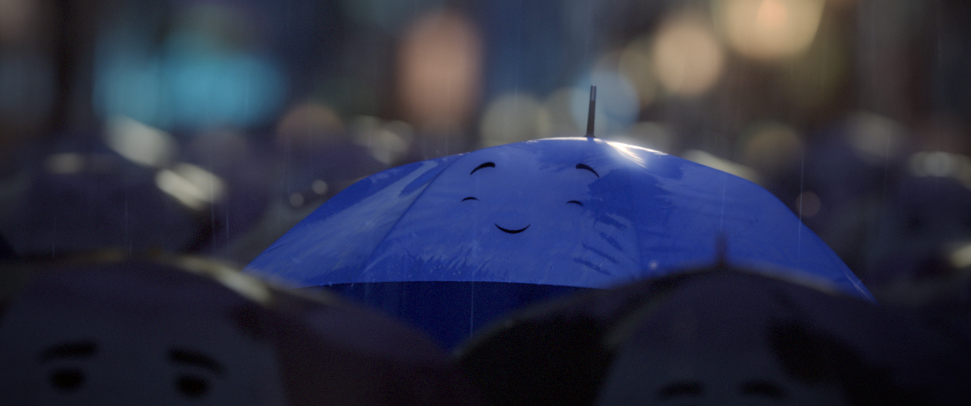
''The Blue Umbrella is a 2013 Pixar computer-animated short film that was released alongside Monsters University. The short is directed by Saschka Unseld of Pixar's technical department. The short featured new techniques in photorealistic lighting, shading, and compositing.'' -Wikipidia   http://en.wikipedia.org/wiki/The_Blue_Umbrella_(2013_film)


This is an amazing animation about the love story of two umbrellas. Their emotions are shown by these simple facial expressions and the change in shapes of the umbrella which are different from a living character who has hands,arms and legs to carry more emotional changes during the story. The designers excluded the umbrellas' nose that simplify their face even more and I think this makes the umbrellas look adorable. What is more, the eyes are like comma which could show direction of where the umbrella look while expressing more interesting facial expressions.

-curious-

-enjoy:closed eyes and raising brows-

-showing interests-

The colours and the shapes really help indicating the gender of the umbrellas. 

Additionally, the umbrellas are designed to match the outlook of the couple.

Monday 10 November 2014

The Bear and The Hare

The Bear and The Hare


This is a Christmas advertisement of John Lewis in 2013 and it is a combination of 2D and 3D animation. It is interesting to see how artists apply their skills in the industry and to solve problem which is the timing in this case. As an advertisement, its time and content is usually restricted but I think this advert has solved the problem perfectly by showing mainly key scenes in order to get to the point straight away. I appreciate the quality of the illustration and the variety of the animals that almost like watching a classical Disney film which creates a nostalgic atmosphere to the audience. For my apply animation, the time is also restricted so it has to be sharp and clear therefore I will take this animation into account when planning the animation.


Apply development 2

I renamed the drawings by using the Abode bridge and brought them to the After effects for edition. I did not remember how to use After effects so I found the online tutorials to assist me. Unfortunately, something wrong happened and I had no idea what was going on. After effects only did 3/4 of the animation for me... due to my lack of knowledge of After effects, I used Premiere Pro to join two videos together and added music and a title. I feel more confident using Premiere but I definitely have to figure out how to use After effects in the future.


The title appears at the end of the animation where it fades in and fades out. I like the effect which I did by changing the opacity of the frame. It is better than a sudden jump out in this animation. 


I am happy with is Apply brief and this has enabled me to push boundary and apply different techniques I have learnt from the pervious briefs. This is my first time to draw about 100 frames of animation.To be frank, it is tiring but very challenging and I see the importance of having a good time plan for an animation. I am very proud of the product, the girl spins smoothly and the facial expression is quite natural. I ran out of time to render and frames to draw the last part of the animation where the squirrel jumps onto the tree, it can be improved by drawing more delicately and better timing and spacing.