Friday 20 March 2015

Title sequence research- The Last of Us title sequence

I found this interview online of the artists who created the title sequence for the video game The Last of Us.


Unlike most games, The Last of Us features a full-blown opening title sequence which plays an important role as part of the prologue. Was this the idea from the start?
ND: We’d never done anything like this before and initially we weren’t planning on an opening title sequence at all. But we had a scene at the beginning of the game where Joel [the main character] is with his daughter Sarah. She’s dying in his arms and then we cut to 20 years later and dive quickly into the journey. There’s a lot of exposition thrown at the player. I think we underestimated the impact of Sarah’s death because people were having a hard time following the next scene — they were still recovering from it.
So, we needed a way to create space between these two scenes, and one of the ideas I came up with was an opening title sequence. We also decided that we could use the title sequence to give players a sense of what happened during the 20-year gap in the story. It would set up the state of the world, the quarantine zone, and the idea of this group called the Fireflies, before we meet back up with Joel. Hopefully, that would give players enough time to recover from the previous scene and pick up the story on the way. So that was the initial impetus for it and then we reached out to Sony San Diego with the ideas.
So how did you go about capturing that “grunge”? What was the process for achieving that texture?


VIEW 3 IMAGES

HH: What was great about this process was being able to send over a shopping list — a list of weird and wonderful materials, different products, liquids, resins — all bits and pieces that were just going to be an experiment. It was down to having this library of materials and substances, I’m sure 90% of which were terribly harmful.


When we started off, we had water tanks, dropping ink into those, which just looked like the same old water tank work seen so often — so we abandoned that. Then we tried every kind of paper surface imaginable, which was nice but again, whatever you added to the paper it still looked familiar.
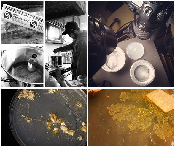
HH: We had this kind of murder room — everything was plastic-wrapped like a Dexter or C.S.I. horror scene — covered in black ink.
KJ: Yeah, I have to admit that creating that plastic-wrapped room and having everything shrouded in plastic really helped.

-------------------------------------------------------------------------------------------
I think the production of the last of us sequence is not big but they have researched so much before the actually making. They have experimented with a range of possible materials and to mimic the fungi is a very precise job. The sequence really makes a successful introduction for the game and they texturised the scene so well that people believe in the material. I think it is a successful animation so I want to try out their working approaches and apply to my work! It might be fun to include different media and textures within an animation.  


Maya Modelling Induction

We had a maya induction and it was all about editing a realistic animation by changing the graph and to create a motion path so as to allow the object to move following path.
  • frame rate is at the bottom
  • Perference->playback speed->real time(24)
  • s=keyframe
  • Window->animation editors->graph editor
  • Render settings->jpg.name.*.ext
  • frame padding=how many significant number
  • the curve graph=ease in ease out
Turntable


Pendulum and Overlapping Action


Editing the line graph by moving each forward can create a realistic and smooth swing of the pendulum.


Bouncy Ball


Editing the curve can adjust the material of the bouncy ball, e.g. less easing could be a metal ball while more easing could be a bouncy ball.


Anticipation


I did not enjoy this induction as much as it is boring to remember the settings in order to animate. If maya does not require any technical knowledge would be excellent. Nevertheless, it is a very useful induction, I have learnt a lot of new techniques to animate in maya. If I have time, this is definitely needed to experiment more into. 

After Effect Induction

We had an induction of the further use of After Effect. I missed the last induction but it is easy to catch up and it was basically about how to create an expression for the layer. Press Alt and the little key-frame clock thingy then type in 'wiggle(frequency, amount of variation)'. This expression introduces randomness to the image and make it more realistic while moving. This expression could be applied in everything key-framable.


I have also learnt to use the camera and light tool to film the animation and I think it is a very professional tool to use. We were given a project to work on. I have used 3D tool to separate the wave layers and added expressions for the boat and the cloud. I am amazed how much After Effect can do for animation! after this lesson, After Effect is actually going to be the next programme I want to explore more with and possibly use it for the Applied animation!


Thursday 19 March 2015

Sketchbook

My sketchbook is usually full of characters designs and concepts of characters. I have been forcing myself to sketch some environment as well but they are usually not finished (no patient to finish them) I like trying out different style of characters and give them personality as well. A constant character designs practice allows me to have more inspiration when designing the story for the project. However, I really do agree with my classmate that I have to try out more styles and working media. Since the Spinning object brief, I have been trying to draw the rough outline in colour pencil before outlining in pencil or felt-tip which I found it extremely useful.

sketching people


Try out one-line drawing 

Characters ideas


Studying machine/robot structure


Wednesday 18 March 2015

OUAN404 Visual Lanuage Evaluation

This module is very fun and playful that provides huge amount of opportunities to draw, to observe and to learn. The Set, Series and Sequence brief is challenging and encourage me to begin the habit of sketching daily in sketchbook to build up my drawing skills and write down instant ideas. It pushes me to generate ideas quickly and develop them further to become some innovative concepts artwork. The live drawing briefs benefit my observing skills. I have learnt to observe the details and the surrounding carefully before starting the drawing, which allows better proportional and realistic sketching. Also, I noticed the choice of material is an essential element to show the weight, the movement and the state of the model. For instance, I used charcoal to sketch the essence of the solidly heavy walk of the model, which successfully show the rigidity. You spin me right round is my favourite brief. It is because I enjoyed working with the light box made by myself and more importantly the well-prepared preproduction work enables me to work fluently towards a good result. There are so much useful skills I have learnt from these briefs, which is important for animating creatively and reliably in the professional manner.


However, I found out that environmental drawing is not as interesting as drawing characters. Drawing buildings or architectures are vey difficult for me. To improve, I need to keep practising in order to achieve some significant progress before feeling bored again. What is more, I found that I could be quite impatient when doing live drawing for too long therefore changing the drawing position constantly helps refreshing my mind while observing the model in different perspectives. Nevertheless, the Form, Flow and Force brief encourage effective communication between teammates and organised teamwork, which provides a lot of opportunities for me to speak up and being part of the group. The crit and feedback from this module has been constructive and honest that aids the improvement of own practice. Many comments suggest me to experiment with more media and not to limit myself with only pencil or watercolour, which is a big encouragement. Additionally, my schedule of this module is not as organised as the pervious module. It is difficult to keep up with all the work from different module at the same time and to follow the planned schedule completely. The context of practice essay and the applied animation have occupied a large portion of the timetable therefore so much effort has been put into time managing. After all, it is my favourite module so far because I can do a lot of drawings and have challenged myself further more. I hope to create an effective timetable for rest of the modules and constantly exchange feedbacks with classmates in order to speed up the progress.

Set, Series and Sequence

I have produced a series of pictures depends on the 32 drawings. I really like the idea of the mushroom creature and I developed further more using various materials and texture.

Colour pencil

Ink

pencil, different perspective

Pen and colour pencil

felt-tip pen and watercolour

watercolour and salt effect

acrylic on canvas

digital drawing

I like the softness watercolour produce at the same time the vibrant and lively atmosphere acrylic gives me.

I really enjoy drawing on paper where I connect more to the image physically and have a better control of colours. I like the felt-tip pen with watercolour the best because the style is very mature and it is a new experience for me to draw seductive character. Also I enjoy using acrylic paint where I can mix and layer up the colours and build up texture. It creates an interesting surface for the character. However, I think more experiment could be done by creating different working surfaces like tissue paper and sandpaper? To make the drawings more organic, I could probably collect grass, flowers or actual mushroom to work with. 


 12 images storyboard 


Sunday 15 March 2015

Rhythm is a dancer

We are drawing the essence of the walk from each teammate in a limited time and try to show the weight and the rhythm of the movement. It is a interesting task to see our classmates' acting skills and how they are going to perform themselves.

Max's walk was a lumpy walk. I emphasis the weight of his walk by drawing a back-heavy figure, to separate his legs, I left a gap between the thighs so that I can clearly state which leg is which. I feel like the drawing should be less human but more flow of lines or shapes instead so I decided to do something different on another drawing.


Amy's walk is fairy-like. She flows and dancing across the classroom. I think light colour can show the lightness and this time I only sketch her arms in order to show her movement. I like the idea but the actual sketch is not as good as expected because it is difficult to understand and unable to distinguish the direction of the move. maybe include the legs and the head are the solution?


For Joe's walk, it is heavy and robotic. I used two hands and two colours to represent two legs and it is very fun to experiment with. The lines end up like electric which is very interesting and this one line drawing discourage any mistakes and sketchiness. The figure also show the direction by the feet which might be very useful when animating a line figure or objects.


Ollie's walk is very heavy and solid. I decided to use charcoal to represent the weight and the atmosphere and this time I draw the negative space of the legs. It is a new attempt of drawing movement for me and the result is as impactive as I imagine. The texture of the charcoal allow layers to build up and so as the presentation of weight. I think it can be improve if I draw the negative space of the whole body instead and include good quality of edge in order to improve the quality of information it provides. Nevertheless, it might be interesting to animate a human figure by using what we have done in this whole brief and I have learnt so much for example represent human figure with only few curves, the use of different materials and the show of weight. 


Like a puppet on a string

We were limited in time to capture the pose of the model in only a few seconds therefore I decided to use water-dissolvable material to produce quick drawings. The flow of the pose is well presented, the shape, the weight and the direction is shown also the volume is an essential element is this part of the brief. We posed from a small shape to expand the whole body so that the surface area increase. I have fun using watercolour because it shows the move abstractly and the shape of the model artistically.

For the other poses, I used felt pen and colour pencil. In that stage, I was still not sure about the exact intention of the brief so I did not try out as many material as I could have done. However, the outline of the model I did below are quite successful in terms of the amount of information they provide and the representation of weight. I think this part of the brief is quite difficult because I have to keep the same volume of the body while changing the shape. It is hard to keep the volume and the quality of line consistent therefore it is quite a challenge. At the end of day, we are all quite familiar with drawing the shape of body and I think this is the progress we made of that day.


Ah,Push it!

I used a range of materials to finish this brief while studying the force, the weight and the density of line. I used water colour to show Amy pulling against the door and the dark blue colours are the part where I think her muscles contrast the most. Despite the lack of refine lines, the watercolour show the figure with softness which I really enjoy.   


I drew Max with felt-tip pen so the figure is clearly shown on the paper and I can apply shadings on it as well. This sketching shows the force quite well through the pose and the straight arms, the shape of the body is also rather proportional which I am pleased with. However, the quality of line and the precision of drawing needed to be improved.


I have made a mistake mixing ink and colour pencil. I did not like this combination at all. Other than that, I think this is showing the force clearly through Joe's arm and the lean of body. We were taught by Annabel to use the pencil to measure the correct proportion of the model which I have applied on this sketching. Not bad I think?


Ollie carrying the chair on his shoulder. He looked so intense and powerful therefore I decided to use ink to represent this act. The intensity of line build up an heavy atmosphere to show the weight of the chair and the lighting. Personally I do not have a feeling about this sketching, not good not bad. It is not good enough because the lines are too sketchy and Ollie does not look that 'in pain'; It is not bad might due to the shading build up an correct surrounding and the proportion is alright.