To improve the experiment, I added an wiggle expression to the clip to create a handheld effect.i first tried (1,50)but it is moving not enough and therefore I put (2,50) just as to allow more shakes and motions. I posted the previous clip on instagram and many people liked it and asked me how to do it. Annabeth saw it and also advised adding wiggle expression to it. I really like the edited version because it is more realistic and improve the audiences 's experience on dad 's first person perspective.comparing to the last clip, the moving camera not only suggests movement but also generates tensions and a story. As the first scene of the story,I think it did a decent job in leading the audience into the crime scene. It is likely that an old film filter would be applied throughout the whole animations, aiming for that retro 1991 style.
Saturday, 18 February 2017
Thursday, 16 February 2017
[Extended Practice]Animation Test2
I did a quick test on an unfinished piece of work and this is exactly what I am aiming at! The trees do stretches a bit and the lines need to be finalized.
So base on the previous environmental drawing that which is traced on top of a real photo, this time I created a total new environment! A combination of my imagination and some elements picked up from real photos. The street is definely wider and more spacious. I hope the 3D would turn out pretty for this one.

This is how it looks like when finished. Like before, I did not colour everything so as to maintain the simplicity and the collages style. I use a dry brush texture for the brick on the wall also a watercolor brush for the shadow cast by the trees, which have some white space mimicking the light penetrates through the branches. I also applied the patterns made before on the houses and real news articles on the pots of the plants. I really like this version of the trees because there are more things to see and less tense. This is also one of the very least environmental drawing I did in my life!so I am very happy about the result.


When it is finished, apply vanishing point and do the previous steps in order to produce the 3D file for after effects. I found that it does not have to be precise when drawing the grids.

I tried a few speed of the camera move and this seems the most suitable. I do not want to audience to miss out the details if the camera moves too fast. I think the 'walls' did not stretch as much as the last test and it creates a nice perspective shoot and it is almost as good as texture mapping in maya. It can be improved by giving a handheld camera which could be faked by applying the wiggle expression to the camera layer in after effects since this is a running scene... maybe speed it up is the best option after all.
[Extended Practice]Animation Test1
I want to include different texture to the animation especially 3D.Since there are quite a few perspective environmental scenes, it might be a good opportunity to test out 3D in after effects. I was thinking about maya before however it is very time consuming. at this stage, I am a bit behind in preproduction so I want to create the background quickly, effectively and efficiently.
The first few scenes of the story is a first person perspective, running through the narrow street which I think is perfect to turn it into 3D.
There are a lot of tutorial on YouTube teaching how to create 3D space from a 2D photo. The one I followed was the shortest in length and the procedures are very clean and clear.

To create a 3D space in after effect is easier than i thought! First, import the image to photoshop , hit "vanishing point" in the filter colum, using the grid tool to wrap around the 'walls' . Export the diagram straight to after effects and it will automatically show up as a 3D space! What after effect did is basically stretches the 'walls' I created in photoshop and form a room-like space. Moving the camera back and forth could allow a first person perspective or even follow the character as it walks
I experimented with my concept art. The general effect looks awesome on a picture which has depth but the street in the illustration is too narrow which stretches the wall too much and distorting every thing on the side like the trolley on the ground and the patterns on the wall. Hence I decided to redraw another environmental drawing that could be suitable for 3D. Possibly with wider street and less details sketching.
Tuesday, 14 February 2017
[Extended Practice]Indesign Induction-Artbook
We had an Induction on Indesign before we started the art book. Basically the art book is our blog, we can put our research, pre-production work in and present with some words and mostly pictures. I have used Indesign a long time ago but have forgotten completely now therefore this is a good opportunity to pick up Indesign again since it is so useful to create zines or any booklet-form work.
It is very easy to use. Most of the features are similar to photoshop or illustrator. Choose how many pages you want and it automatically sort out the double pages and the covers. There is a thing call A-Master which is like creating a style and apply it across the book. For instant, a name at the footer and it will appear in every page. (Not just A-master, B/C we can add more templates)

We made a 3mm bleed, an extra space prevent cropping the images out or make sure the image reach the edges.

I searched for zines design and most of them are very simple. One simple and bold image on one page and some pages could even be blank to let the other images stands out. Since I do not have much to show.... It might be a good idea to make it artistic and simple(being smart and cheeky:D)


Thursday, 9 February 2017
[Extended Practice]Character Design(2)


I used the previous line drawing as the template and started colouring the character and draw it clothes as well. This is basically my dad's character who is one of the main character in the animation. There are two more main characters who should make a strong contrast between my dad, my dad's teammate and one of the criminal. According to the previous tests and research, I decided to give my dad very simple clothing like jeans and plain top. I think this is the most 'police-looking' casual wear with modest plain colour. Since he was not wearing uniform, it might be difficult to tell his occupation, so I gave him the warrant card to indicate that.
I am not sure about the patterns outfit... I am afraid that it will be too much to see but more tests are needed. I want to use colours to indicate the bad guys and good guys since they do not have facial features or significant uniforms. I will use a tone of blue for the officers based on the Hong Kong police uniform and edgy colours for the criminals like red or brown, indicating danger and accident. I also insert some white shapes on the character and even make some outline go white so that the character could stand out before any dark environment or busy textures.
[extended Practice]Character Design(1)


I noticed that I have no reference on the clothing of dad in 1991 and also it was unclear what the police officers wore at that time. Therefore I asked my dad to send me pictures of him in 1991 thus start sketching the rough character design. He told me that his post did not need to wear uniform, partly because they are the 'secret police', wearing gun wherever they were. I can still remember how he took out all the bullets and let me and my sister played with a real gun!
The key features in Hong Kong1991 was definitely the the hair; it seems like everyone had curly hair and curled up into a uncanny shape... a lot of volume and generally short hair for the officers; denim jeans or jacket, it was the basic fashion items everyone had at that time(I was told), and dad said he usually went to work with T-shirt and pair of jeans; clean design, there were no bold imageries or fancy patterns on the body, also usually plain colours.
My dad's features are his signature brushy eyebrows and big glasses. I thought these features could make him stands out from the rest of his team(I do not have any references for the rest of the teammate therefore I will make sure their characters will not over shone my dad!) I also do not want to give the character eyes and nose. This is due to maintaining the brevity of the animation. At this point, I want the animation to be action and camera angle focused..Considering the scenes in the storyboard, there are only 2-3 shots there have close up of the characters, there are not many facial expression focused shots in the animation. Therefore I think getting rid of facial features might be a good way to comprehend the style and could also allow more imaginations from the audience. However this still need to be tested later. It might be possible to give the characters mouth or eyes when come to a close up shot.

Sketching outline from photos. I noticed how bad I am in life drawing but I really want to maintain this photogenic style through out the animation so I need to constantly practice drawing real people.

Sketching on blank paper. I managed to get the proportion of the head right but not the body! My anime style stretches the body too much and the head becomes so small and the legs are too long.

I try to use red pencil to correct myself and I could see where the problems are. Making a scale helps a lot and I am determined to keep drawing people in real life during the rest of this term!

[Extended Practice]Art Book-issue
At this stage, I do not have much to put in to the art book. However it is a good practice on Indesign and how I can approach to a better art book near finish.
I designed the art book that I can cut out shapes on the front page which reveals the coloured background on the second page. This makes my art book stands out from the others also more interesting to look at, attract people to pick it up. I enjoy it very much and definitely revisiting it when more work is done.
Wednesday, 8 February 2017
[Extended Practice]Storyboard3
I finalised these storyboards after reading books as references and reconsidering the composition. I think these are pretty much the final version of the story. However they are not finished yet, they still need notes and write down which lines they are referring to. I am happy with these because I spend a lot of time trying to raise the quality of drawings inside which make my production much effective and efficient. I will slightly colour them in photoshop just as to have a review on the lighting and the use of colours. These storyboards could be improved further by adding more details for instance the direction of the characters, sounds and other composition notes which I will be doing in photoshop for the next stage. I am very looking forward to the final final storyboard!


[Extended Practice] Callum and Hayley's sets[2]
Me and Hayley went down to the wood workshop again. This time planning to get the windows done by using the laser cutter. I have used a laser cutter before in foundation but I forgot it so learning from the beginning. Hayley had used it before and she remembers and cleverly created the illustration of the window with red lines indicating the cutting lines and blue lines as the edges!


When started, we expected the laser cutter will follow where the lines are in the illustration and go straight to the middle of the board and start cutting but it started off at the corner. I saw that and immediately asked for help. We were told that the laser cutter will not automatically fine where the lines are even though we have all the measurements sorted out. The guy helped us to put a mark just at the corner of the lines indicating the start of the laser point which then make it works. Luckily the marks were not too deep. Hayley decided to flip the burnt side facing outward so we do not waste a board. We are going to put wallpaper on top anyway.

Here is the fun bit! poking the pieces out! We carefully poked out all the pieces. The grids are kind of fragile so we needed extra care and love.


Finished! Looking awesome!

Hayley also gave me this timetable for their group. I think we are going to finish the set in February so that they could start animating before March. I feel very responsible for their sets so I will give out more time on it. To do so I will need a perfectly plan out timetable for myself in order to keep everything on track for my own project.
\

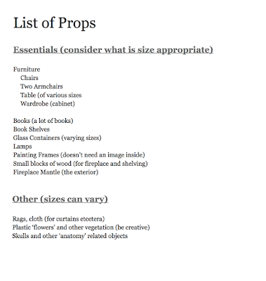
Gladly I am not the only one who is doing the props, Hayley and Callum are helping as well so I feel less stressed. There are a lot of things we could found on e-bay or amazon so I will be mainly focusing on the walls, and woodwork and look for any useful material in town like crafting materials and fabrics.. etc.
[Extended Practice] Storyboard Research
I borrowed some books from the library about storyboarding and composition since I really want to improve my skills. These two books I found super useful, they explain things in great details and demonstrate with illustrations.

Master Shots by Christopher Kenworthy
100 Advanced camera techniques to get an expensive look on your low budget movie


Inside the book, it has a movie shot as the reference and 3D model showing where the light and camera is and the actual effect on the screen. What is more amazing is that the writer use moods as each chapter's title and describing why each camera angle is suitable for the mood and emotion. I especially look at chasing scenes and tension. I learnt that hand hold method could create an intense mood and making audience believe that they are part of the story. Also lighting is very important. I am going to put a lot of effort in environmental design to create the perfect atmosphere for each scene.

Another extremely useful book is The storyboard Design Course by Giuseppe Cristian
The ultimate guide for artists, directors, producers and scriptwriters.
This book explains a lot of basic knowledge about producing a film that I did not know. For example the drawing style of the board will alter the result of the film. If I am working in a big team, the storyboard is also a concept art that I always neglect the power of it. It is true when I tried to make the storyboard looks like the final outcome, it allows me to draw the scenes more accurately and precisely than just using the storyboard as a reference of the camera angle like what I did for the last two years.


It also shows a lot of examples of transition shots, like similar cut, where a scene showing an object in one place and jump to another similar object in another place; or clips in between clips; straight cut and zooms etc. All these interesting transitions I have never thought about. I become really interested in considering camera angles so hope some of these new stuffs I learnt could be applied in my storyboard.


Composition, considering light and camera movement

Subscribe to:
Posts (Atom)