I made a quick map of where the police and criminals are at the crime scene. This makes the composition much clear. I know where the characters are standing and what should be the background. I believe audience could figure out the geographical sets if I give them enough information in the animation.
Studying old photos from 1991 in HongKong, the colours of the photos are blueish, with high red saturation also with the typical film texture. To figure out how to apply film textures on clips, I found a lot of tutorials on youtube! It is very easy which I would try this later on the tests.
According to the tutorial, I retouch a photo I took during research into blue tone. I really like the feel of it, it looks like a film photograph with high contrasts which ages the look of it.
I draw outline of the photo because I know that the animation is going to be texture focus. Placing texture under the line drawing could allow audience to aware of the surrounding at the same time enjoy the visual impact of mix media. At the moment this is still seems like a very feasible idea to do but I am definitely doing more research later.
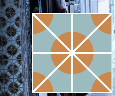
I also made patterns!

I cut out shapes from the original photos and paste onto the line drawing to make it more stylish. Slightly off the line give a print-looking illustration.The texture at the back flavour the screen but not too much to draw all the attention. I want to try it out on other photos and carry out more visual research in general.
I also apply film filter found online
The corners are darken a little bit making the scene looks even more retro.


No comments:
Post a Comment