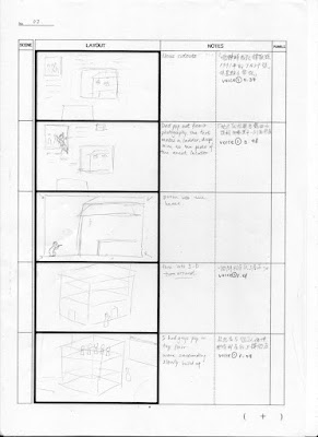
I started storyboarding with a storyboard template found online. Honestly I think this is better than drawing grids by myself. It is time saving with better quality as well but the bad thing is that it become more serious and it is harder to draw ideas quickly. Less thumbnails looking. There I think it is very suitable if I use them in the final storyboards.
This time I am desperate to try out a lot of interesting camera angles and other filming techniques. Also I think creativity of the scenes are the key when using mix media style since audience is not only focusing on the content but the textures as well. I turned out hated these first storyboards because they could hardly link to each other and it feels a bit too much playing with camera angle. Also I have not decided on the mood of the animation. It could be a serious story but telling it in a funny way or just remain serious. What is more, I found out that the composition is important. In all my previous animation, I ignore the background because it is my weakness but this is I really want to make it to perfection. To do so, I first need to sort out the surroundings, where did my dad came from outside the village? where are the criminals? Where are the rest of the teams? This I hope could make the animation more reliable and should be easier to plan out the scenes.
* I was trying to mix different animating methods before. For instance, including stop motions and 3D animation. But I sat back and found that too complicated and the scenes would not match each other so I gave up this idea and I believe this is the right choice. Considering with the time, I really lack of time if working frame by frame.
Overall the first storyboard is too farfetched and not consistence style also no flow of story. Start it again!


No comments:
Post a Comment