Saturday 29 November 2014

After effect induction

After effect is a program that can edit videos and to create moving images. I have experienced this program before when making the stop motion animation by following the online tutorial. I managed to edit the animation step by step but I am not familiar with it at all. This induction is very useful in teaching us about the basics and inform us what the program is capable with. I think it is very alike Premiere and I could not tell what is the difference between...They perform quite similarly therefore I picked up rather quickly during the lesson.

Notes

  • The panels can be resized and changed by selecting [window]->[workspace]
  • [Preference]->[Media & Disk Cache] Cache is the temporary file the computer creates itself in order to make things quicker if doing repetitive job
  • [Settings]->[PAL D1/DV Widescreen Square Pixel]
  • Layer properties is the small triangle pointing to the right
  • [Composition setting]->[resolution]->[full/half]
  • Key short cuts:P=position; A=anchor point; R=rotation; S=scale; T=opacity; N=end of the clip; B=beginning
  • Always play back using RAM review!!

Monday 24 November 2014

The classical element- Interim tutorial (group crit)

I have presented my ideas to my group and I received some unexpected responds and useful suggestions from them. The presentation went quite well and I was not too nervous which allows me to explain my ideas clearly to the group and this improvement encourages me to speak up. My group mates have a lot of good ideas and developments for their own projects and I am very impressed about the efforts and time they put in. Providing them comments and opinions enable an alternative way of reflection on my own project for instance what do I need to focus on and what am I missing.  

  • We have discussed about the content of the two storyboards. Most of them like the simplified storyboard (the second storyboard) better due to the rich in camera angles and the simplicity of it. Max said he found the unexpected plot in the first storyboard is quite interesting and maybe I could create another storyboard with a twist but simple simultaneously.
  • The second storyboard would be more appropriate to do in terms of the time management, the workload and the amount of information. 
  • Whether the balloon character should own a facial expression or not. I told the group I have watched The Red Balloon and the balloon does not have a face in the movie but it could still act and show its thought. Amy suggested that I should give my character a face because in the movie, the audience have time to discover the character. However, as we have a time limit, it should better be sharp and understandable which I think is the most useful comment of the day.
  • The style of work:

They like the sketchiness of these illustrations especially the style which the outline does not fit the drawing. 


They are not really fond of the white outline and they thought this art style is a bit commercial. Looks like a birthday card. However, they like the faces without the mouths better. I am thinking another way to combine both style together as I really like the art style on the last one.


They suggested that I could tone down the other colours in order to let the yellow to stand out from the crowd as It would be odd to see kids holding black balloon after all.

I feel much more confident about my work after the crit and I am going to take their opinions into account. The next things I need to do are:
  • To decide on the style of work
  • tone down the colour of the rest of the balloons
  • Sort out sound effects and background music
  • Primary research on the natural movement of balloons and observe.

The Classical Element: concept art

I really want to draw this animation in photoshop because I am not good at digital drawing therefore it is a good opportunity to challenge myself. Base on the media, I have drawn some fundamental concept art for my animation on photoshop. The quality of the drawings still need to be improve but the sketchy drawings give me rough ideas on the use of colours or styles on the characters.


I am trying to find an appropriate colour for the main character. I noticed that red could catch a lot of  attentions but it could be quite intimidating and it is an angry colour. The other colour that is still eye catching and happy is yellow and I am happy with me choice.


I do not like these concept art because the drawings are too sketchy and I wonder if they will look professional enough as a finish product. I tried different styles of art on the character for example with outline and in various shapes. I feel like they could be developed further more and base on these ideas, I move on to another style of art shown as below.


I am happy with this style of art better than the previous illustrations because I like the graphic design and the hand drawn visual effects. The facial features are simplified that the balloon now have no mouth as it could still express its feelings using only its eyebrows and eyes. Excluding the mouth makes my character unique and less Japanese anime looking which I have been avoiding all the time.
I doubt about the colours. Should yellow be the only bright colour within the balloons or not? I am hoping to gain some opinion from the interim crit.


The classical Element: Storyboards and Anamatics

The problems of the previous storyboard are:
  • too much information to show in 20 seconds;
  • too complicated
  • too much workload at this stage( I have not done primary research and refine a storyboard)

The anamatic suggests that there are too much information within the story which would be difficult for audience to understand straight away.

Therefore I designed another storyboard instead and this time it is shorter, sharper and easier to understand as a 20 seconds animation.


 (random cat sketches!please ignore!)


I think this story better than the previous one because:
  • it is shorter
  • clearer
  • appropriate workload
but would it be a bit random at the end?

Sunday 16 November 2014

The classic elements development

We are given a topic, the classic elements, to produce a self directed project. I could not decide on which elements to work with therefore I made a mind map at the beginning to help myself identifying the potential of the elements and possibly choose an appropriate element to work on. 


After a few brainstorm, I noticed that water as an element would be fun to develop so I started sketching ideas down. I drew fantasy creatures like mermaid and dragon and marine life like dolphins and fish. I like the idea of letting tropical fishes as the main characters the most because I like the way they swim and the habitat they live.


I picked up the project after a few days again and I had another new ideas which is to use both air and water to produce a touching story. First, I list some ideas on my notebook about the combination of those two elements and I came up with: flying fish; Swimming balloon; Swimming bird (penguin); and Ballon fish. Balloon fish gave me the biggest inspiration therefore I made a rough storyboard and tested out different possibility on creating a story about balloons and fishes. I want to do some research on the facial expression of an object.

This is the second attempt on the storyboard. I quite enjoy the story in terms of the characters and the camera angels but there are some frames I do not know how to present them for example It is difficult for me to draw a boy who gets a jump due to a shock.


I was recommend to watch 'The Red Balloon' which is a film about a balloon that has a character. I found it extremely useful as my idea is similar to the film so there are some good reference and problem solving techniques I could learn from the film.

Friday 14 November 2014

Le Ballon Rouge (The Red Balloon) by Albert Lamorisse


The Red Balloon is a short movie about a little find a red ballon on the way he goes to school and find out that it has its own will and mind which can communicate to the boy by floating up and down and other actions. The director had geniously given the red balloon a character and own thought by only using it actions and movements which blend in so well with this no-dialogue movie. Also, the vividity of the balloon brights up the boy and his surroundings which differ him from the dull town and the audience can feel the joy and magical atmosphere even more.


I think it is appropriate to not give the ballon a facial expression. It is because the director can show more skilful techniques in order to impress the audience. Additionally, it allows more spaces for audience to project their feelings onto the balloon and encourage diverse emotional responds to the story.


This is my favourite part of the film where the little boy asks for shelters for the red balloon from the people who have an umbrella on the street on a rainy day. This action shows the innocently mind of children and how human can generate relationship with objects by giving them minds and wills like human. 


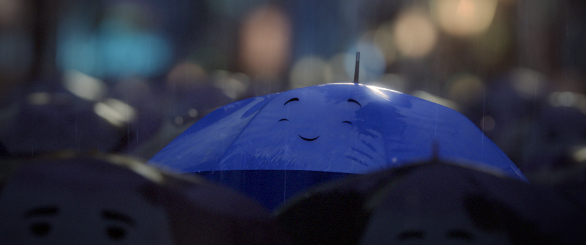
The Blue Umbrella


''The Blue Umbrella is a 2013 Pixar computer-animated short film that was released alongside Monsters University. The short is directed by Saschka Unseld of Pixar's technical department. The short featured new techniques in photorealistic lighting, shading, and compositing.'' -Wikipidia   http://en.wikipedia.org/wiki/The_Blue_Umbrella_(2013_film)


This is an amazing animation about the love story of two umbrellas. Their emotions are shown by these simple facial expressions and the change in shapes of the umbrella which are different from a living character who has hands,arms and legs to carry more emotional changes during the story. The designers excluded the umbrellas' nose that simplify their face even more and I think this makes the umbrellas look adorable. What is more, the eyes are like comma which could show direction of where the umbrella look while expressing more interesting facial expressions.

-curious-

-enjoy:closed eyes and raising brows-

-showing interests-

The colours and the shapes really help indicating the gender of the umbrellas. 

Additionally, the umbrellas are designed to match the outlook of the couple.

Monday 10 November 2014

The Bear and The Hare

The Bear and The Hare


This is a Christmas advertisement of John Lewis in 2013 and it is a combination of 2D and 3D animation. It is interesting to see how artists apply their skills in the industry and to solve problem which is the timing in this case. As an advertisement, its time and content is usually restricted but I think this advert has solved the problem perfectly by showing mainly key scenes in order to get to the point straight away. I appreciate the quality of the illustration and the variety of the animals that almost like watching a classical Disney film which creates a nostalgic atmosphere to the audience. For my apply animation, the time is also restricted so it has to be sharp and clear therefore I will take this animation into account when planning the animation.


Apply development 2

I renamed the drawings by using the Abode bridge and brought them to the After effects for edition. I did not remember how to use After effects so I found the online tutorials to assist me. Unfortunately, something wrong happened and I had no idea what was going on. After effects only did 3/4 of the animation for me... due to my lack of knowledge of After effects, I used Premiere Pro to join two videos together and added music and a title. I feel more confident using Premiere but I definitely have to figure out how to use After effects in the future.


The title appears at the end of the animation where it fades in and fades out. I like the effect which I did by changing the opacity of the frame. It is better than a sudden jump out in this animation. 


I am happy with is Apply brief and this has enabled me to push boundary and apply different techniques I have learnt from the pervious briefs. This is my first time to draw about 100 frames of animation.To be frank, it is tiring but very challenging and I see the importance of having a good time plan for an animation. I am very proud of the product, the girl spins smoothly and the facial expression is quite natural. I ran out of time to render and frames to draw the last part of the animation where the squirrel jumps onto the tree, it can be improved by drawing more delicately and better timing and spacing.


Apply development

I use premiere pro to trim the music down to 9 second. It is fast and easy to do it through premiere as I have used it before. It is different from editing a video where you can see the image but editing a audio, I have to depend on my hearing to get the parts I need precisely.


This is the timing and spacing plan. There are a lot of changes during the drawing when I did not go with the plan which is bad and could easily cause confusion. Luckily I did not make any mistakes this time but it is better for me to stick with the plan next time.


After finishing all the drawings, I scanned them into the computer at once (I regret it as it took so long and really bored to repeat the process therefore I will scan in the drawings in the number of 10 once I have finished). Painting the main sections according to the lyrics.


I did not do anything to this scene because simple is good, I do not want too much colours in this animation.


I really like the outcome when Winter melts into Springs. The trees look like melting ice cream and the green have done a good job in showing Springs.


Evaluation of OUAN403

First of all, it has been a great experience so far since the beginning of this module. It is a bit different to my expectation but the briefs are still well planned and very educational. I have learnt a lot of new animation skills for instance the basic 12 animation principles and making animation by Photoshop. The best brief for me is the Pixilation and Apply brief where I could bring in my creativity and cooperate with people.  Since the foundation diploma I did last year, I am aware of the importance of having a good timetable and effective distribute of work. Therefore I think I am quite organised and have good work ethics during this first module, as I do not want slip just because of the less workload compare to last year. What is more, this module has assisted myself to keep a habit of documenting processes, evaluating own work and exploring more into the animation industry in real life which I would definitely gain benefits from and to build a strong fundamental base for the whole course. I treasure every opportunity provided from this course and what I have gained from these briefs have encouraged me to appreciate animation with new perspective for instance look at how the special effects have been done and the character designs etc.

I could have enjoyed this module more by integrating more into the group and to step out of my comfort zone. During these two months, I have noticed the advantages and importance of working as a team therefore I hope to be more daring to speak and to take risks in the next module. Additionally, I think my drawing skills need to be improved because animation is all about drawings after all and my drawings are usually sketchy and untidy. This affects me when drawing animation on paper, the sketchiness disable a clear copy when tracing over and therefore leads to bad quality of lines and lost of consistency.

In the next module, I hope to experiment with different drawing media for instance colour pencil and watercolours. Also I want to investigate more into traditional animation because it helps to improve my drawing skill and doing hand drawn animation has given me great experience. Despite the time consuming process, it is traditional and challenging, which requires real drawing skills like how it was at the past. Although digital drawing is not my strength that I try to avoid when possible, it is also a skill I hope to be good at and hopefully to master because I want to push my boundary and to try out as much as possible in this year.  Nevertheless, I hope to have better narrative and presentation skill that would enable me to produce animation in a higher standard. To conclude my experience from this module, it is fun and experimental. I have learnt a lot useful skills and able to apply them onto my work and I am looking forward to the next module.

Sunday 9 November 2014

Airy me by Cuushe

Airy me by Cuushe

I knew this music video because of my illustration interview in Leeds college of Art. Such a magical experience to exchange good artists that me and the interviewer like and this is what I gained from him. A beautiful music video that looks like hand drawn with only a few colours background, the animation makes a compliment to the song which reaches to the deepest of my heart. Even though I have watched this video for many times, the real messages behind are still a mystery to me. I love to think and explore while watching an animation and this is the one that constantly suppling new ideas to me every time I watched. I have not figured out the meanings of the lyrics but with the animation, I think it is trying to raise the issue about self-awareness and to keep the faith and I enjoy investigating the messages behind such thoughtful animation.


KUROKO by unknown artist

KUROKO by unknown artist

I found this animation a year before and I am totally falling in love with the work style and the concept of it. It is a final piece of a student from a Japanese Art school and the concept behind is that when you are supporting someone, you also get supported by another 'someone'. The artist makes the 'someone' wearing the funky outfit to group them together so as to distinguish them from the main characters. At the end of the animation, the man wears the outfit and expressing the message that it is his turn to assist someone's living. I think this is a brilliant animation reflecting the social situation of the world and showing the importance of citizens to bond together to form a society. I appreciated this animation because it has a great message behind which encourages me to feel a sense of belonging to the society and also shows the good natural of human when living as a community.


Flip books by Juan Fonatanive

Flip books by Juan Fonatanive

These incredible flip books are created by Juan Fontanive. He recycled the old parts from bicycles and clock to construct the flip book machines which can allow a constant and convenient view of the flip books without using our hands. He hand draws, paints and screen prints those images of the beautiful nature onto paper that forms an interesting contrast between the flipping machine and the organic drawings.


I like these flip books because they are so alive and unique. I have never known that flip books could worth such wonderful presentation that instantly bring them to another level. The sounds from the machine has made a compliment to the movement of the images and it makes me feel relax as if I am listening to the sound of wind and river. The birds in the flip book look different (or maybe different specie) but Fonatanive is able to keep the consistency and the outcome is incredible showing various colours from each frame.


Saturday 8 November 2014

"Almost There" from The Princess and the Frog by Disney

"Almost There" from The Princess and the Frog by Disney


"Almost there" is an insert song in The Princess and the Frog where Tiana, the main female character, expresses herself to her mother, telling her that she is almost there reaching her dream of opening a restaurant in her own town, New Orleans. The reason why I like this part of the movie is because during the song sequence, the animation shifts to an art deco style which makes the song matches her imagination. Since the change of art style, the context has been simplified to fit the art and the colours has also changed into a warm and dreamy tone. This twist of art within an animation make it more enjoyable to watch and personally I like art deco style so It leaves a memorable impact on me.

Ratatouille by Pixar

Ratatouille by Pixar


Ratatouille is my favourite Pixar animation so far due to the warm and touching story and also the encouraging message behind. It teaches me a lesson to believe in myself and follow the dream when I was lost and depressed. The contrast between the experimental Remy and the rest of its ordinary family makes it stands out with a bright and daring character while Linguini also stands out from the chefs because he is a cook that cannot cook. The character designs are the main element of this film that each of them are very unique and have a distinctive features that brings out a lot of sparks when the characters are interacting with each other. The stage of this animation is France which brings out the romantic sense even more and with the French main theme song. Bravo!


Dragon Nest by Eyedentity Games, Inc.

Dragon Nest by Eyedentity Games, Inc.


Dragon Nest is a MMORPG game from South Korea which has been published globally since 2007. This is the game I have been playing for two years and never get bored due to its fantastic story and CG animation. Players can choose different classes to start with and can have their class changed while gaining experience by defeating various stages and bosses. I really enjoy this game mainly because of the wonderful character design, the character designers have put in so much delicate details onto each characters which allows them to stand up in the game also the weapons are unique and even the texture are close to reality. 


She is my favourite villains. She is a dragon and this is the look before her transformation. The character designers have given her a cute look and fashionable outfit which is beautiful and functional at the same time.

Friday 7 November 2014

The collagist by Amy Lockhart and Marc Bell

“The Collagist” by Amy Lockhart and Marc Bell


This is a cut out animation that is consisted of different levels of crafting skills from scrap paper to a cup of coffee. The animation is simple in the narrative and plot but it is crafted in a very high standard and every action is carefully planned in order to achieve the best result. I especially like the hands which have joins so that they are flexible to carry different jobs with difficult motions also the timing of the smoke is very accurate to show the gaseous features. They have investigated the potential of the paper as a working material and have shown somethings unique to the audience.

The media helps them to explore more possibility of paper to tell a story and to learn built up texture on the paper. I think this would be really interesting to see of a movable commercial billboard that would definitely catch attentions and unique but also it has the potential to be a card that the receiver have have fun reading and playing with the letter which could improve the communication between the society. 

Redial music video by Livetune

Livetune feat. 初音ミク Miku Hatsune「Redial」Music Video


This is a 3D music video created by Animation Production: Kaikai Kiki Sapporo STUDIO PONCOTAN and the song is sung by Miku Hatsune written by the Livetune studio. Miku Hatsune is a is a humanoid persona voiced by a singing synthesizer application developed by Crypton Future Media, to make it easy, it is a programme that can sing. Its aim was originally to help the song creators who do not have enough budget to hire a singer but there is an increase of famous studio, song writer and singers cooperate with is imagined singer due to her fame. 
The music video has included all the best things about 3D animation for example realistic composition, body gestures and probably money saving. I really like how the animation is matching the lyrics and the song, the dance is rhythmic and extremely smooth in terms of the move of the character. They have already introduced a lot of products of this music video for example T-shirts and posters to show the potential energy that a successful animation can hold. It is definitely communicating through the best channel as Miku Hatsune is all about the future world and technology which internet is the most appropriate way the message can travel.

Transfer music video by livetune

Livetune「Transfer」Music Video features 中島 愛


This song and music video are created by a creative studio called Livetune which is famous in the Japan anime industry. In the music video, the studio has tried a variety of way to tell a story by using different materials, content and even sound effect to differ each little story from the others. The action of the character matches the music and the background also she changes her role of the story every time when another context has been applied which I think it is very interesting to watch.

It does not have a specific target audience and everyone should enjoy this communicating method. I think the music video has definitely helped me to understand the song and the crazy thought behind. What I appreciate the most is the creativity and innovation within this music video, it is cyber and still having the traditional Japanese anime features in the main character. Combining new and old elements together is probably one of the reason why Japanese animation could be so successful in the animation industry.

Wednesday 5 November 2014

Untitled by Golden Wolf

This short stylish animation is produced by the London-based studio Golden Wolf, featuring Omar Salazar the professional skater of skate shop Doomsayers. This animation is unique and providing an inspiring perspective of the experience of skateboarding. The Black and white colour makes this animation really stylish and giving me a vision 'It is for the cool ones'. The story is attractive that the studio is involving various random events which are expressing powerfully with brilliant linkages.


I think Golden Wolf has used an effective way to promote the skate shop as it can show dynamic movement of skating and has included some far-fetched creativities which video cannot be able to do normally. The target audiences are obviously skaters and teenagers who are aware of this brand and this sport therefore Golden Wolf has focused on showing the creative, energetic and youthful features of teenagers within the animation. It is not a commercial yet but I think it has a great potential to be one. In today's world, putting an advert via social media might actually do a better job than a TV advert due to the improvement of technology and life habit therefore I think Golden Wolf has chosen a good communication pathway that spreads the message to the public effectively.