Wednesday 10 May 2017

[Extended Practice]Critical Evaluation

Aim of the animation:
Extended Practice is the module I appreciate the most in this year. I was excited to visualise the true story of my father. We are very close and his retirement from the police force in last January is the trigger to this animation. His passion to the job inspires me to animate his memory and to make him proud. Another main reason is the disrespectfulness to police officers among teenagers in Hong Kong, mainly due to political reasons. I wish to bring out the message that every occupation should be respected and appreciated especially who put themselves in danger for our health or safety.


What techniques did I use:
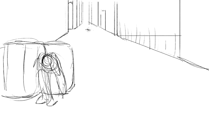
I mostly used Photoshop and After Effects for animating and editing. The animation is drawn digitally and coloured by both scanned in watercolours and watercolour brushes, with different angle and direction in every single frame. However, this is very time consuming and caused a lot of confusion when too many layers in a file. Nevertheless, I decided to repeat outline even when the characters are not moving. This repeating method gives more movements which I discovered in COP that it brings life to the characters. There is a huge difference between a still line and a line that is constantly moving which basically establishes the major aesthetic of the animation.
Additionally, I also experiment with 3D animation in After Effect. I learnt this from YouTube and I enjoy self-teaching a lot. I can learn a lot in a short time by watching various methods online but being selective is also a difficult task.
 
Time management:
I am exceptionally proud of the time managing skill during this module. The first timetable was done at late February that was the time when I found everything was not organised and I was too chill to work hard. Week plan works the best for me because it gives me flexibility rearrange ‘timetable within the timetable’ also it is less intimidating than shuffling a lot of work in a day. I am glad that I followed the timetable strictly because this pushes my limits and be ahead of the schedule. This is a skill I need to keep and improve in the future and I believe it will lead me to some good companies.
Target audience:
At first, I was just aiming at Hong Kong audience as I thought foreigner would find it difficult to understand the story. My perspective changes during all the crits and production. The animation already breaks the wall of language and everyone can enjoy it visually and aesthetically. Therefore, I will say it is open to all age groups in the world who is interested in 2D or intense content.
How does this animation develop your specialist practice?
I want to be specialised in 2D and this animation is a valuable practice to showcase my skills also experimenting. I show the ability to adopt different styles in work also to develop as well as working effectively and efficiently. The theme of the animation would be attractive to Hong Kong animation company and the aesthetic could help setting up my brand.
Group project
At the beginning of the module, I volunteered to work with Lauren and the group of Callum and Hayley because it is fun to work with others also I can gain more experience when collaborating. I designed characters for Lauren based on some real photos of her and her sister. It is a good practice on life drawing and practice real portion which is also useful to my own project. Although the final character designs were anime looking, I had a lot of valuable practices and we both agreed on the design. For Callum and Hayley group, I made props for them because I love crafting a lot also want to expand this skill. Hayley taught me a lot from sticking wood pieces together to measuring for laser cutting. I gained so much new knowledge in a short period of time and very pleased to have good communication with the two groups, definitely want to get involved in more group project in the future.
 
What have you learnt?
I have learnt so much during this module. From planning out the project to actually producing it, I have never thought about completing a 2 minutes animation by myself. It proves that I have stepped out of my comfort zone and challenged myself with a difficult goal and achieved it eventually. The sense of satisfaction is priceless. I learnt to organised my time and schedule additionally spending extra time to work with other groups so as to gain more experience . I challenged new approaches to the software, exploring them even further and achieve the mix media style I want. What is more, learn to rest. My wrist was so stiff due to long hour working without resting. Hopefully there is no long-term effect but this is when I noticed the importance of taking a balance between work and rest.  Animators’ hands are life! Finally, and the most rewarding, learning to appreciate myself. I always have high standard and seldom feel pleased about my own work. During the production, receiving all positive feedback increases my confidence and started accepting others’ compliment rather than hiding my work from others. Although I still feel a bit embarrassed when showing the animation but I definitely appreciated it more and be proud of it.
Improvement
I wish to do more research at the beginning on the texture and aesthetic that I want. My resources are limited geographically so I should have taken more reference photos in the Water Head Village. The voice recording of my father is not perfect because it was not recorded in a completely quiet space and I wish to do something to relax him. As I mentioned how repeating lines could give life to the character, I should not repeat the line when the gangster is shot down so as to follow the idea and contrasting the living and the dead characters. This is due to not enough animation tests which should have done more at the beginning.

Tuesday 9 May 2017

[Extended Practice]Poster

I asked almost everyone about how they do their poster. Most of them are very simple with a big title and a tagline. I spent a long time thinking about the strap line because I want it to be a little bit playful and not just a boring description of the animation. Eventually I picked : Just a normal day at work, a bit of humour and playfulness and I hope my audience would feel curious by looking at the poster.


A rough idea, sketched on photoshop. This is the time when the officers are running to where the gangsters hid. Showing a lot of surroundinng buildings and it is 7 o clock in the morning so the colour scheme will be blue and yellow.


Using the vanishing point again! It is so useful when drawing landscape. Following the lines already helps a lot with the perspective and ratio! Highly recommand!


Transferring this semi final draft to an A2 file and resketching everything.


Oscar gave me this advise of making the poster in A2 so as to make sure the best quality when printed also can be in high resolution in any size smaller than A2.I took his advise even tho the file will be rather large. This is what professional designers or typical thing to do in the creative industry so I need to be generous of the size of the file!


I also use CMYK so as to ensure better printing quality. The colour looks good and the water colour do not lose the texture when enlarged which I am very pleased! However not sure about the position of the title and the colour as well. The title was distracted from the building behind which meands it should be moved to somewhere else!

I call this my final poster! The title are not straight but slightly rotated to fit the gaps in between the buildings and to match the perspective of the illustration. I like the texture and the shapes as well which gives a lot of information about the aestheic of the animation, let people have a taste before watching. 

[Extended Practice]Trailer

I went on Vimeo to look at examples of short trailers. The styles I like are all very simple and show quick montage of the film. In our case, we only have relatively short animation so picking the most exciting bits is probably the best to do.

orfeu TRAILER_1 from nelson boles on Vimeo.
Short and dynamic. Showing a lot of actions to attract audience to keep following.

WIND - trailer from robert loebel on Vimeo.
 
"Nino&Felix" (short movie) Trailer from LaTestuggine on Vimeo.


Good use of music, syns with the shoots and brings a lot of rythem to the clip. Based on the research, I think a 20-30s trailer is more than enough. And It went quite well on the first attempt.


Reusing the school logo and credit from the finished animation. It saves a lot of time making this trailer and along with the effective sound I found on the youtube audio library. I like this trailer because I kept it simple but informative. Having both quite and exciting moment of the film and the music adds so much to it and Oscar said he felt pumped afterwards so I guess this is great!haha.

[Extened Practice]Final animation


After readjusting the sound levels, the final animation is done!!! I am very pleased with how it turns out eventually! I showed it to many people and they give a of positive feedbacks about the aesthetic and the concept of the animation which make me really happy and satisfied. Unfortunately there is no extra time left for any detail retouches and I was only able to revisit one scene which Mike said the patterns on the buildings were very odd. Nevertheless, this animation is done now. The whole project was valuable and very rewarding. I pushed my boundary and finish the whole project by myself which is unbelievable. It is festival quality and definitely submitting it to as many festivals as I can to let the world know I did this! Also can not wait to show my dad, he will be so proud!

Sunday 7 May 2017

[Extended Practice]4/5 Final Crit

Our final crit was held in classroom but I really hope we could watch our work at the theatre again. Nevertheless, we had set the 'standard' sound level so we can base our animation on that and adjust the right amount of sound afterwards. Everyone has great progress since last week and all the work are diverse in style and topic which makes our course so unique and free! At that time, I still have 2 more seconds to finish off the animation and also had most of the sound effects sorted. I think the level of sound effect is still a bit low but the humming music was on point. Annebeth suggested everyone to spend a day on sound and music since it is very important to a completely finished piece also Lauren pointed out a misspelling in the subtitle. 

What I need to do now is to correct the subtitle, render two completed animation with and without subtitle, finish off the sound, the press pack , evaluation and also a subtitle in Chinese as there are a few asian animation competition require Chinese subtitles. Let's crack on!

Saturday 6 May 2017

[Extended Practice]credit

Instead of working with a graphic designer, I want to create my own title because by then it can be 100% made my Wing. I looked for some fonts online and picked these three types because I love how they emphasise on lines and not constrained to any shapes.

This font is very 'The Great Gatsby' feel and do not match the style.

The final decision come to these two. They are very similar but one with tidier strokes and one is more causal in terms of the shapes.

I picked the one below at last because I think the lines will look good when repeating in three, the way they wiggle with be similar to the outline I used on the character.


Obviously I did not copy the font straight from the picture, I changed the directions of the strokes while following it and gradually become a unique font for my animation.


[Extended Practice]Music and sounds

There are a lot of website that do free background music. I searched youtube audio library the most because it is categorised perfectly when finding specific genre of music or sound effect as well as have a lot of choices. I also use the BBC sound library at school which I picked up some nice environmental sounds and gunshots. Although there are not much suitable but all the sounds are in super high quality that is amazing. 

I found this ambient sound from youtube library which is just a subtle humming sound but I think it is the perfect choice to go behind the speech and can be used to gradually intensified the scenario if increases the volume. I have to put this in my caption box under my animation tho.


Devastation and Revenge by Kevin MacLeod is licensed under a Creative Commons Attribution license :https://creativecommons.org/licenses/...

Source: http://incompetech.com/music/royalty-...

Artist: http://incompetech.com/

I am just using the first part of the music before the humming sound stops and repeat it in Premiere. The atmosphere matches and the animation suddenly becomes lively and tense! It is amazing how much just a humming sound does to my animation. I always take it for granted but it is definitely one of the key element to comprehend the perfect story just like how 
Loic Burhardt, leading sound designer from Folimage said in the masterclass in MAF. I still remember the example he showed which the sound of rain is different at different location. I applied it in my animation too, where the scene showing the gangsters indoor and slowly zoomed out of the building. I used lowpass effect in Premiere to reduce the 'broadness' of the sound.

[Extended Practice]27/4Crit

We could see our work on big screen today! How exciting! It is also time to test the sound and bits and bobs before final crit. The atmosphere changes completely to just watching on little screen in classroom, seeing our work on theatre screen has an utterly impact that everyone suddenly become more serious to the project. Anyway, try not to sound arrogant here but I am on schedule compare with most of the class. It is due to I follow my table table tightly and determined to complete a scene before moving on to the others. I would not say proud of my time managing skills since it should be the fundamental skills to have as an animator or in any job. I believe that being organised and punctuate is the most important in this project because I hate panicing at last minute. However, I could finish the animation on time also mainly due to my simple approach in aesthetic and a story that is very straight forward unlike other peers who has come up with fantasy world or complicated storyline. The screening was great, I enjoy others' animation as much as well as reflecting on my own. The sound effects seem too quiet and it feels a bit plain without background music. Quite similar to Max's animation and I asked him a lot for advise who suggested to add some subtle music that could just go quietly at the background. 

Generally, I am very proud of what I produced so far and just need to fix a few things:add more sound effects, find appropriate background music, finish the rest of the animation and the press pack.

I should be able to complete the animation before deadline so leaving more time to finish off more blogs also hoping to help others' out if they needed.

[Extended Practice]Drawing explosion and smoke


I have never animated smoke or any special effects before... so this scene is very difficult! I started with rough sketching of the smoke. Considering the force of the explosion and wind and all those kind of stuffs are not easy at all. It did not look natural and almost too gentle to be an explosion.


It might sounds silly but I took a lot of reference from the battle scenes of One Piece and other manga. I read manga a lot and I immediately thought about the fight scenes in One Piece when trying fixing the smoke. There are a lot special effect drawing in every episode so I learnt how to draw smoke and using a lot of lines to show the flow of air and the sense of speed as well. Oda Eiichiro, the author of One Piece uses shading and leaving blank space to show different stage of an explosion.


It turns out totally different from the first attempt and it gains so much more volume and powerful. I am glad that the style of manga matches my animation and super pleased with this new technique! I focused a lot on the shading of the 'little clouds' diverged from the smoke and every clouds should flow to different direction due to the power of the wind which should also be random to be realistic.


After this scene....it comes the most challenging scene in the whole animation which is the spread out of the smoke. It is so difficult because the smoke is moving while changing shapes. I messed up so many time that was unable to do both motion at the same time. Therefore looked for reference online. Could not find something more useful than this following picture. Although it is a diagram of how to animate fire, it shows clearly how air flows hence how the special effect should look like. I adopted this tutorial and spent so much time on this scene, hoping to master the smoke...


Eventually, it took two  days to finish this scene and I know they are not the most perfect smoke in the world but I am still quite happy with the result. I like the volume of the 'calm' smoke and the reduce in size where it moves away from the bomb. However, it is quite stiff and did not look like gas but solid instead. It might due to the strong black line I used and too much continuous lines. It might be better if I give the brush more shatter in the customise section so that the line could be less intense. 


[Extended Practice]Change of storyboard...

There are some big changes to the storyboard while working along with it. I found that there are a few panels should be reconsidered because of the lack of information or do not link the scenes before and after well enough.
They are the scenes where the bad guy threaten Rambo by pulling the trigger of the grenade and originally it was followed by a transition of the grenade reflected in Rambo's eye and showing the fear. But obviously I did not give the characters any eyes or mouth so the storyboard is not working. I am glad that the scene followed it has finished already so it is easier to think of a way linking the scenes instead of changing the whole story completely.


Another scene was after the gangster shot, originally dad was looking at the sniper and show appreciation while Rambo ran next to him. The problem is that the most important bits were not included which is to show the grenade is detonated that why Rambo escape. Also dad's action did not have much meaning to the story therefore I steal some time from that part and turning it into a close up scene of the bad guy. Hopefully it gradually builds up the tension and showing that something big is coming that why people need to escape from that.


I think it is a reasonable correction because the storyline flows better and the more important shoots are put in which is essential in such short time. I tend to keep the background simple towards the ending of the story since the main focus it are the characters and audience would not be distracted by the detailed buildings and texture while some important plots are going on. However I should have thought about the storyboard more carefully at the beginning of the project so that the production could go much smoother and the contents would not contradict. To be honest, there have been a lot of minor changes during the production which I think it acceptable since it is difficult to foreseen all problems. I wish to improve the storyboarding skills so that my work can be more appealing and easier to understand and this animation is an extremely valuable experiment of new techniques and approaches.

Tuesday 25 April 2017

[Extended Practice]Short reflection

I have quite a few thoughts during this stage of the production.
1) I wish I spent more time on storyboarding, considering composition, layout before drawing the final storyboard. Obviously I did not considered well enough so that there are some timing issues and scenes change during the production. Although there are no rules saying you can not change your plan half way through, schedule might be interrupted. In my case it is fine because I am working on my own but it should not happen that much if working in a team.

2)What I would like to improve this is use of camera angles and layout. I was doing PPP research and at the same time stepped back from animating and watched quite a lot of professional animations from different studios or just from internet. I noticed that my animation is very compact in comparison. It might be a problem happens to immature animators that trying to pack so much in such a short time. Problems I am facing is not only translating Cantonese into the international language, in this case animation, but also create this intense atmosphere. Sometimes I feel like I am too constricted with getting the realism in the animation so that quite a lot of moves and actions are limited. There are many examples on vimeo showcasing how space can be changed when characters are in their 'mental world'. 

3) To much information in a scene. I need to learn to simplify a scene, not only talking about environment but the art of showing where the characters are.
For instance, a scene from Behind the School Bag 2015 by Nic Ho uses only a door and a toilet to show where the characters are not even adding sink or mirror. Remove anything not needed, simplify the set to extreme. The problem of my animation is that no all the buildings are needed...so why not thinking about get rid of some in some close up shots?

Nevertheless, I also learn to appreciate my work a bit more. It is quite impress to finish a 2.5 minutes animation by myself in three months with other things going on. Considering the time limit and the 'workforce', I should be proud and treat this animation as good practice and reflection.

Sunday 16 April 2017

[Extended Practice] Complicated Scene

This scene took a long time to finish, not only because of the detailed drawing but also the morphing sequence. I also wanting this surreal expression of the intense atmosphere build up through out the scene, by the moment the door opens and every officers are alarmed and tense. I use only lines for the quick actions to give the sense of immediate action also they could go on top of the background without hiding any details behind.

I came up with this morphing idea during production since it will be bored to have too many cut scenes. I hope the colour help informing the audience about the identity of the character also simplified the scene a little bit. I think it works by showing what the polices and the gangster doing at the same time without the cartoony sectioning the screen or normal cut shot.  


If I have time to revisit this scene, I will slightly elongate the duration of the background so that when the bad guy finishes morphing, audience still understand where he is standing and relating his position with the background.  

[Extended Practice] The right things to do?

The colouring method I have been using, is probably not the cleverest way to use. I colour the character in white first and use clipping mask for the watercolour so that it will stay in the previous colour layer. 

It is very time consuming when doing this to every frame. Similar effect could be done in AfterEffect using tracking but it is difficult to get the exact pattern I want. I wish there is a quicker way to create the same result...
Having too many layers also easily causes confusion and mess up, luckily it just happened once or twice to the project. However it is not a sustainable method to use in the future because it will become a total mess during group project even if every thing is named correctly. I already tried to sort them out by putting them in folders and it helps organising a bit.

The other method I tried is combining the lines with the colours but it becomes a problem when editing after. I want the colour and the lines in different colours when the triangle shapes places on top so it does not work if the lines merges the colours. Perhaps colouring frame to frame is my only choice.

Nevertheless, the aesthetic is kept through out the whole animation and remain the consistency. I also like this scene because of the shifting perspective of the camera, showing the sniper at behind. The falling action is also smooth and making a pretty composition. 


[Extended Practice] Timing

During the Crit on the 30th of March, Mike also slightly mentioned about the timing of this particular scene. The running seems taking up too long and could be shortened a little bit. Personally I was struggling to furnish this scene due to the blank background at first. I found the character very dull in front of bank background so I used watercolour and some new cuts to create the current look. It is a bit worrying if it is way too surreal for a documentary like this and if the cut shots too quick. This is a scene full of unsure so I will definitely revisit it. What I will change is probably the duration of the running action also change the presentation of the 'pre-detonating' pose of the bad guy. Instead of showing the reflection of the grenade in Rambo's eye like how I was planned in the storyboard, I want to simplified it into just showing Rambo's hands grabbing the bad guy's hands in order to present a clear action of Rambo preventing him from detonating the bomb. Nevertheless, I like the gradient of colour built up in the close up of the gangster. It slowly generate tension and the level of danger in that situation which I hope audience could feel that from the screen!

Saturday 15 April 2017

[Extended Practice]time the scenes

During half way of the production, I was confused by the actual duration needed for every frame. The frame rate and actual time got mixed up and ending up do not know how much time needed for each scene. Even with the time code in the animatic, calculating time is the most horrible job in the world and I tried so hard but failed. Therefore it is time for to search the internet! I found quite a few frame calculator websites online and the one I am showing below is the most efficient and clear to use. 
So I can put in the starting time of the scene according to the time code and the finishing time as well, it automatically calculate the length of time of the scene. (remember to alter the correct frame rate before typing in the time). 
Eventually I got a list of the time needed for each scene in seconds 


THIS HELPS A LOT! After sorting out the time, I roughly understand how many frames I need to draw for each scene so that I would not over drawn or drawing not enough so have to revisit scene. The timing also allows a better overview of how scenes link to each other. For instance when a 2 seconds scene comes before a 8 seconds scene, I will leave 1-2 seconds at the beginning of the longer scene for transition when it is avaliable.

I should have done this at the beginning of production because every scenes should be precisely following the animatic otherwise the 'improvising' will messed up the rest of the scene especially having a voice recording to follow. This animation very different to the previous animation because I need to follow closely to the voice recording, unlike the previous documentary our OWL group did which we recorded the voice afterward. What is more, the 'improvising' is what I usually do, casually elongate or shorten scenes since there is no limitation. Therefore it is challenging to have a strict 'rule' to obey to but at the same time I feel more oganised and well-prepared. I think making the time plan is a good idea to continue in the future even if I do not follow eventually. It clears things up and reduce confusion.

[Extended Practice] Camera direction

A power of camera direction! I finished the scene when the bad guy goes down stairs. There are two options of this scene, one is the camera pans up and one pans down. Technically I know the camera should follow the direction of the action but visually it looks better when the camera pans up which also able to show the red colour of the bad guy's T-shirt. I should have drawing the character and the background smaller so as to allow space to zoom in or out, allowing more opportunities to alter the scenes in AfterEffect. If do so, the camera is no question panning down with the action.


After asking Mike about these two tests, he agreed that the colour of the shirt is more important and oddly the pans up of camera does not look strange in this scene! What I know is to draw the 'secure area' of every scenes so as to ease the editing and do not limit myself with the current storyboard. Just slightly larger than the canvas maybe 2100X1200? so that I could fit them into the 1920X1080 composition in AfterEffect.

[Extended Practice]Time table March to Mid May

I made my second time table from March to Mid-May just after submission. I found ticking boxes works best for me. Instead of strictly saying what to do each day, I give myself weekly plan, listing what must be done in the week and ticking out the scenes and how many blogs I have done. By doing so, it gives more satisfaction and sense of timing to my current stage. The time table including PPP blogs as well so everything should be right on track and by following so, the animation could be finished a week before submission thus having a bonus week to finish off other blogs and touch ups.

I also developed a habit of using sticky notes everything when a new thought or a 'work waiting list' come up so that I do not forget them in the next second also make sure they are under the spot light which will be accomplished. For the rest of the four weeks, I will be finishing the rest of the animation which is around 30 seconds, progressing well! 


[Extended Practice]30/3 interim Crit

There were not much comments for me on that day since mine is last of the list and it seems like my animation is on track so most of the feedback was just keep animating. At this point, I still have about 1min 30 seconds left therefore I should be fine to finish most of the rest during Easter. There are a few things I want to revisit after the crit.

Subtitles:
I looked at how Hong Kong movies usually have their subtitles and they are in white and in both Chinese and English. 

I added two bars to the composition according to the format of the traditional Hong Kong movies as well as the white subtitles. However the white colour did not show very well and I could not see the words from a distance. Therefore I am going to change it into black instead.


like the scene below, the grey background hides the subtitles so it is very unclear.
I will also consider different options like white words black borders or shading of the words.

Background Noise:
Reduce background noise of the voice recording.->search online!

sound effect:
Mike suggested using the sound library, using sounds effects only instead of using music. I think he is right about this because music does not really work for the documentary. If time allows, there will be a chance recording the sound by myself like walking sounds, wind blow and other environmental sounds. Nevertheless, I really want to stress the sounds and it should be important to the animation.

To round up, I want to finish most of the animation during Easter, leaving at least one week for final touch up. Catch up with blogs and PPP... Luckily there are no serious problem with the animatic so I can focus entirely in animating.  

H.P. Lovecraft animation

This is the last day of my collaboration with Callum and Hayley's group. Today I made a fireplace with the mantelpiece and painted it to a marble texture. I am very satisfied with the outcome and my painting skills! What I also did is cut all the legs of the desks and chair out of a long dowel BY A CRAFTING KNIFE...it was almost impossible to do. They are all in 3-7 cm which did not have a big supporting point for me to hold the dowel. I really wish there's a coping saw!  


We also went down to the print room to print out the wall papers and the floor and the patterns are found by Hayley which I think go well with the furniture. They are in matt so when the light hit the paper there will be no reflections that cause unwanted light source as well as looking more like really wooden floor.


After all, I do not think I did much for their group. It is very difficult to cope with two project in one time especially when both are important. I do not want to disappoint their group for not being productive so I asked many times if there's still anything I could help but I think Hayley also wants to take greater part in props making so she politely declined so I did not ask anymore. Anyway, I enjoyed working with the team. I learnt that it is important to understand their story before helping because looking back at first, there was no questions at all from me to their project, not even their storyboard and I just wanted to craft so badly. Later, when their schedule started, I did not understand the background and time period of their story so Hayley explained to me why we painted the furniture into dark brown colour. All in a sudden, I knew that I should treat this as my own project, by doing so saves more time and excess work, also creates the best sets. It is a very precious experience! I think I am good at taking orders and be a good teammate since I work fast and efficient. The collaboration informs me my ability and I shall embrace them in the future collaboration work as well. 

[Extended Practice]Reduce background noise

I noticed that there are quite a lot of background noise in the voice recording. It might be due to a low quality microphone or the room is not entirely silent. It is too expensive to get a high quality microphone which costs about 50 pounds so I bought a 20 pounds microphone that has all the function I need for recording just has a bit of flaws of being a bit too big and only works with a computer. So instead of lending a professional recording room like what school has, I choose to record my dad in my room so some noise from the street was unavoidable even when the windows are closed. I realised how perfect the equipments we have at school for free since a professional recording studio costs a fortune in Hong Kong, it is not a price students could afford.

To solve this problem, I decided to search for noise reducing methods in both AfterEffects and Premiere. It turns out that the 'noise reduce' tools in AfterEffects is not for the sound track but the noise grains in pixels so Premiere is my only saviour [for free]. 

Open the audio effects and use DeNoiser which is a radio looking tools that reduces the background noise perfectly and it is so easy to use as well. This a a very useful tool to use in the future as well especially when there is buzzing noise in the background, not sure if it is powerful enough to reduce street noise but still exceptionally brilliant to use. 

[Extended Practice]9/3Animatic Crit


It was our Crit on animatic today and we had chance to show our work in process and other semi-final work far work to the rest of the class. I enjoyed watching everyone's animatic because there are such diverse genre of animation that everyone is doing which we could give constructive feedbacks to them. Before this crit, many of them had seen a clip on instagram which I posted and they loved it. There are a lot of positive comments and compliments on the intro of the animation that I am very happy with. Obviously the 3D engine in AfterEffects gives so much credit to the aesthetic I am achieving and therefore it is a sign to keep exploring the use of 3D elements in 2D. Also I asked couple of questions:
Which character design they like the most?
For my dad's character:
they raised an issue of the place of the warrant card. Many of them suggested that it will look more like a cop if the warrant card is put around the neck and it just looks like a helper in supermarket if it is clipped on the clothes. I think it is very constructive because I have never thought about this issue. At the beginning I assumed audience know that they are the police but I really not suppose to make any assumption. This is why people always say bring as much details as you can in the animation and pretend that the audience know nothing about the topic I am working on. So even this kind of minor details could make a big change of the story.

Also they like the second outfit of the first illustration more. Personally I like the first one but I will see how the outfit will go with the background.


For Rambo, They pointed out that I drew him too bulky like Ralph in Wreck-it ralph. haha probably because of the hands and the huge feet. This is a result of lack of practice in life drawing and try to draw muscular people without knowing much about human bodies. It is good they pointed out these mistakes and I will visit the design again.


For the bad guy, many of them love the idea of having the bright red on the top which makes the character more villainous and contrasting to the officers. 


I also asked about the issue of triggering the grenade and the subtitle issue.


As I said before the grammatical differences in Cantonese and English is huge especially in the order of words and I do not want to expose the plot on subtitles before the images on screen and Annabeth said it is possible to change the meaning of English slightly to solve this problem. It does not have to be the exact translation of the voice recording so I could rearrange the English subtitle whatever it fits the sequence. Also they suggested me to work on the grenade scene first so that I could show it and discuss the scene further more with the class at the next Crit. I will definitely spend some time on this scene first but maybe not this week and it might be useful to make a better plan of how the bad guy detonate the grenade before starting to animate. What is more, I need to blog about festival in PPP, look at the range of festivals I can submit this animation to and where it fits.

Thursday 23 March 2017

Callum and Hayley Collaboration


Hayley sent me some pictures of their sets and it looks so great! The atmosphere is built up so well with other little props and texturised so well. I am happy with the props I did because they sit so well in the set and matches the aesthetic they want especially the portraits and the fireplace. It is very happy to work with Hayley and Callum.  I learnt that referencing is very important especially in stop motion because every prop has a chance to interact with the character and will be very noticeable if the style are not matching. What is more, measuring the props in the puppet size is more difficult than I thought. I started at the time when the puppet still not yet done so I could only based the furniture on measurements from Hayley instead of testing the puppet. The chair turns out a bit small for the character and it can barely sit on it. Therefore it might be better if the puppet is made first and we can measure the actual character instead which would help producing preciser and functional props easily.