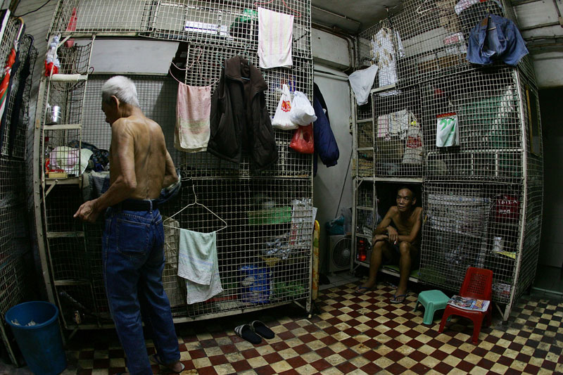
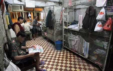
The pictures above showing what the typical tile in the old apartment in Hong Kong. I think the photos inspires me to use a aged filter or a different tone of colours compare to outside the building in my animation since I want to show a contrast of where the gangster stayed and how dangerous it is.
Also the tiles pattern in the gangsters' hiding place.

In my storyboard, I pictured the room as a very messy but yet quite empty. Not much furnitures but only contemporary supplements such as finished lunch boxes, water bottles, cigarettes, rubbish and 2-3 mattresses but no bed at all according to the news cut.
At first I was sticking to the originally greenish-tiles also animated a water droplet dripping in the water bottle to add some moving elements to the scene so it is not just a still picture. I think the image speaks itself and make it quite clear that it is a scene showing indoor especially with the shadow casted by the window. However after putting the rest of the clips together, I think the green makes the scene very clam and not intimidating at all and what's more importantly is the idea of making colour takes over the animation. Red is for the gangsters and blue is for the officers as I decided in the character design so it is important to keep this through out all the scenes.
At first I was sticking to the originally greenish-tiles also animated a water droplet dripping in the water bottle to add some moving elements to the scene so it is not just a still picture. I think the image speaks itself and make it quite clear that it is a scene showing indoor especially with the shadow casted by the window. However after putting the rest of the clips together, I think the green makes the scene very clam and not intimidating at all and what's more importantly is the idea of making colour takes over the animation. Red is for the gangsters and blue is for the officers as I decided in the character design so it is important to keep this through out all the scenes.
Therefore I used hue to change the colour into red-ish purple. I do not want to use bright red because I want to gangsters to stand out in red but not the floor but I think it did the job explaining the dangerous area especially when there's a clip following showing what the bad guys are doing in the apartment.


No comments:
Post a Comment